Icelandic camper travel · Visual identity
WildCampers
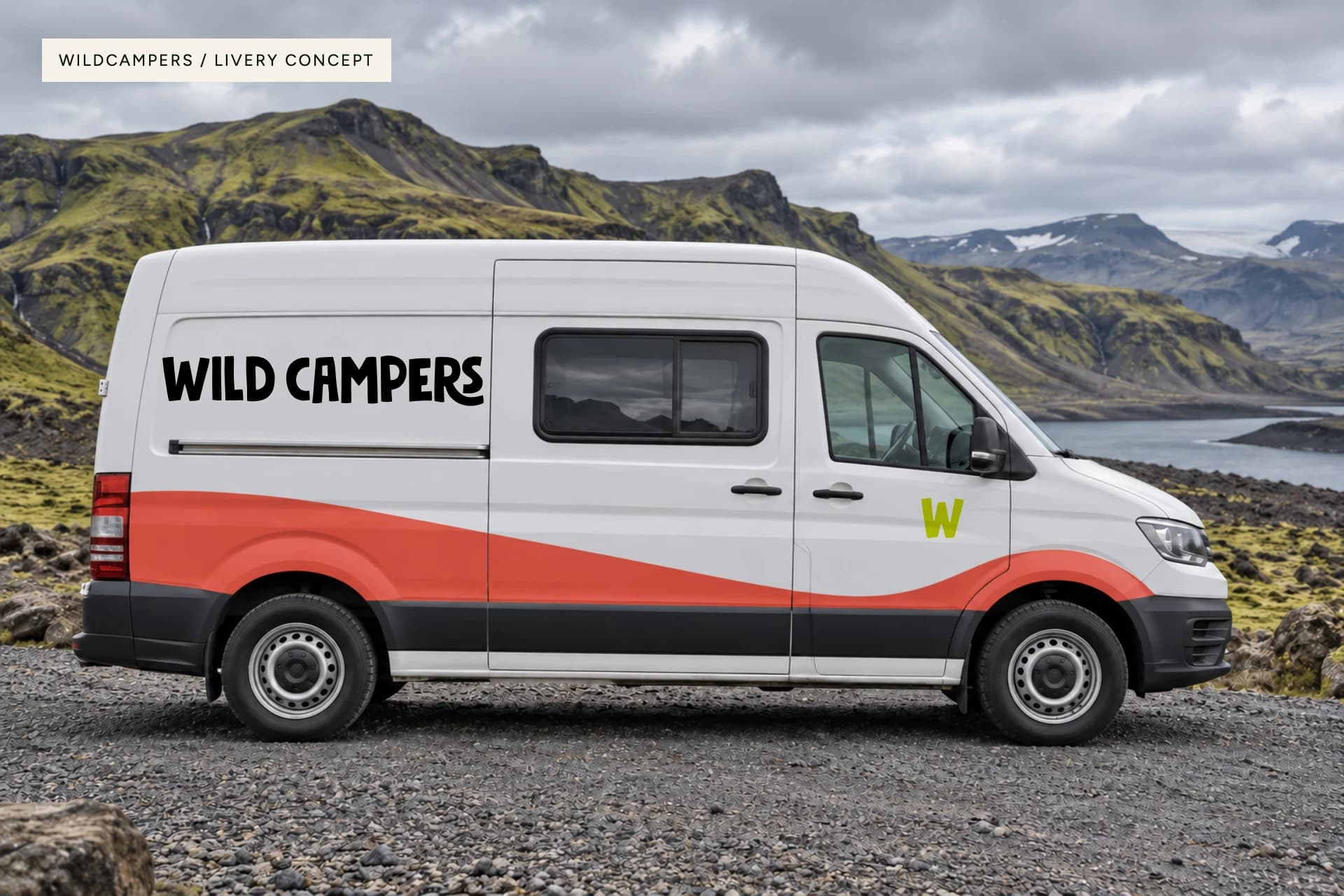
A little wilder. A lot more character.
- Services
- Visual IdentityLogo DesignArt DirectionPrint ConceptsVehicle Branding
- Industry
- Travel / Camper rental
- Year
- 2024
Challenge
WildCampers is a camper rental brand in Iceland. Its identity needed to carry the spirit of independent travel and stay recognisable on everything from a passing van to a small printed keepsake. The brief called for something adventurous, natural and playful.
Approach
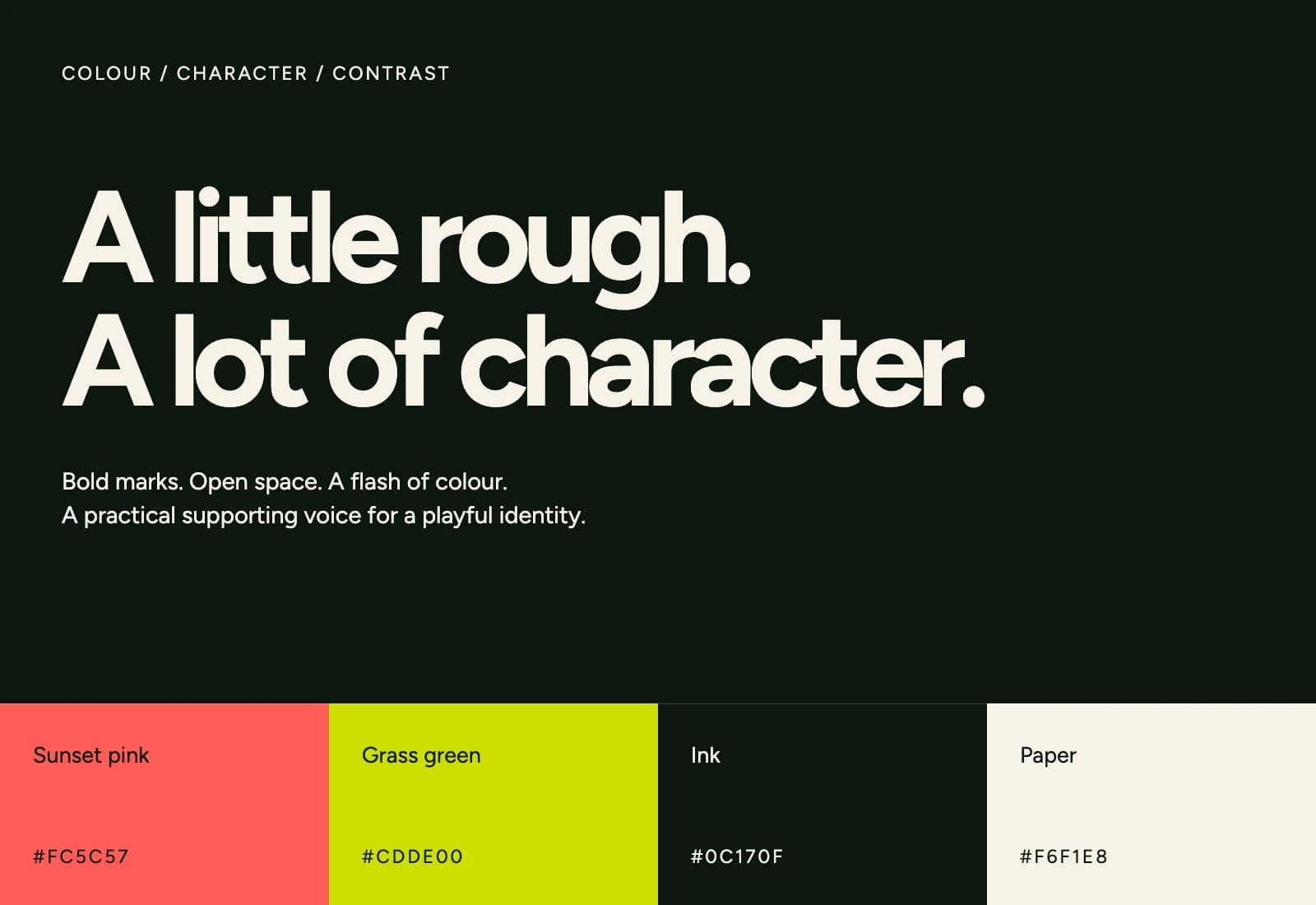
The Wander Agency explored road-inspired graphics and a bold, irregular wordmark, supported by a compact W symbol. Sunset coral, grass green and dark ink give the later identity its character. This presentation brings the original logo assets together with new livery, campsite and campaign concepts, showing how the system can work across a whole trip.
A recognisable shape. A free-spirited voice.
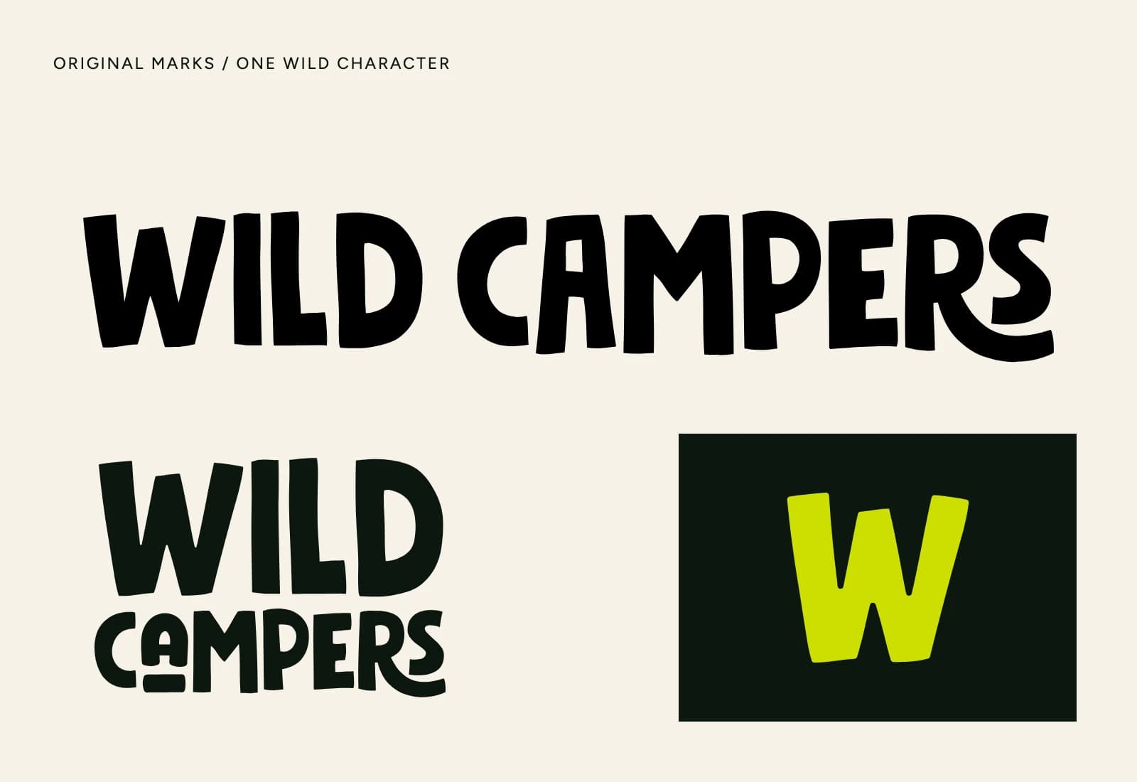
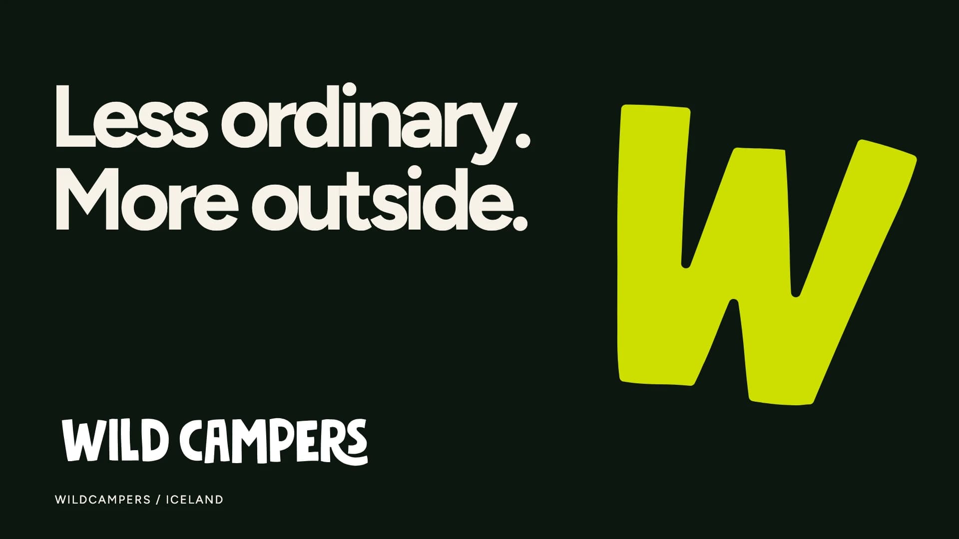
The lettering’s uneven rhythm gives WildCampers an informal, outdoor character. Horizontal and stacked signatures handle different formats, while the W works on smaller objects. The original coral and lime accents bring energy to a simple dark-and-light foundation.
Leave room for the place.
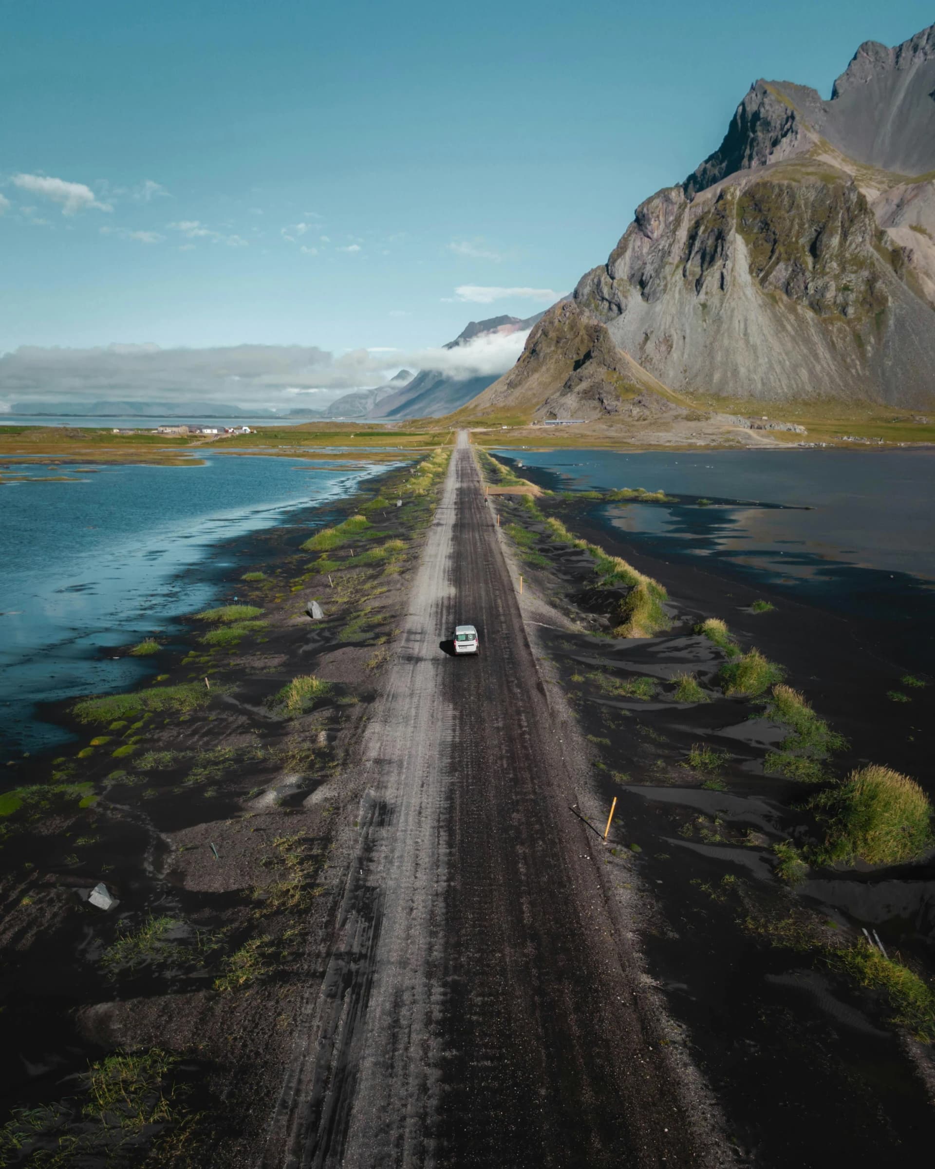
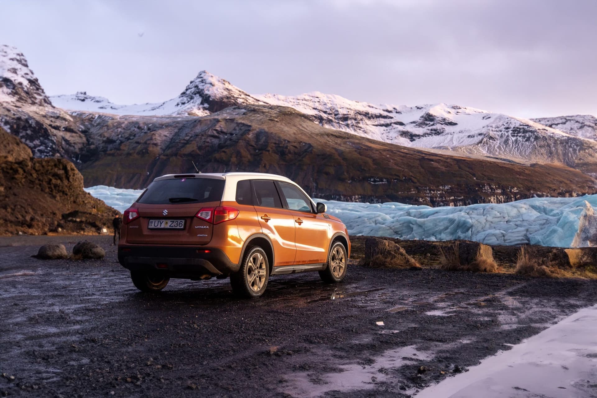
Iceland’s long roads and open landscapes give the identity its context. A strong mark can sit quietly beside a photograph; it does not need to compete with every mountain or horizon.
The early postcard proposals used the curve of a road as a graphic idea. That sense of movement carries into the new camper study, where a coral stripe follows the vehicle’s length and the wordmark stays easy to read.
The small things become part of the trip.
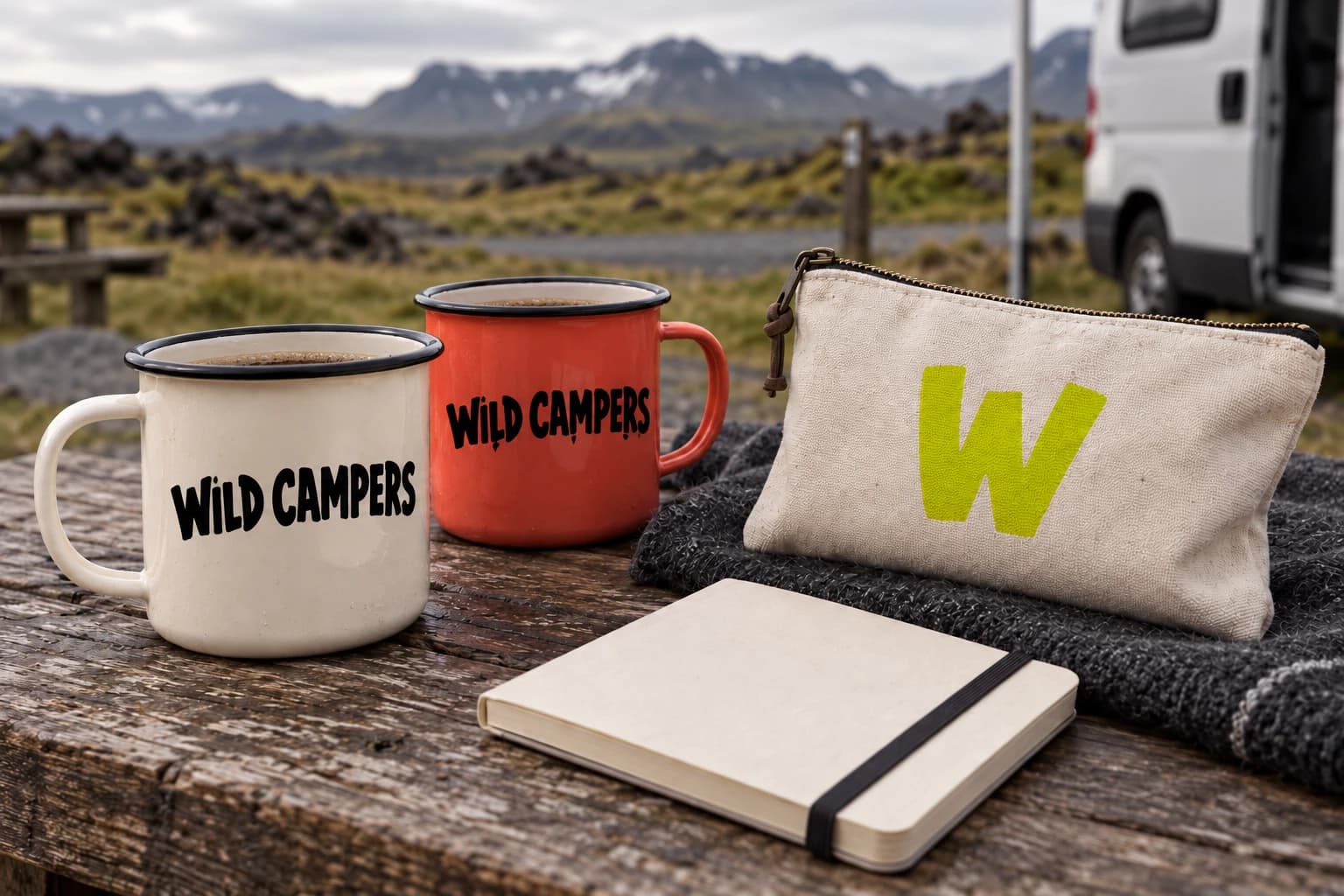
Enamel mugs, a canvas pouch and a pocket notebook give the identity a more personal scale. These campsite concepts test the same marks on useful, tactile objects, with small flashes of colour connecting them to the camper.
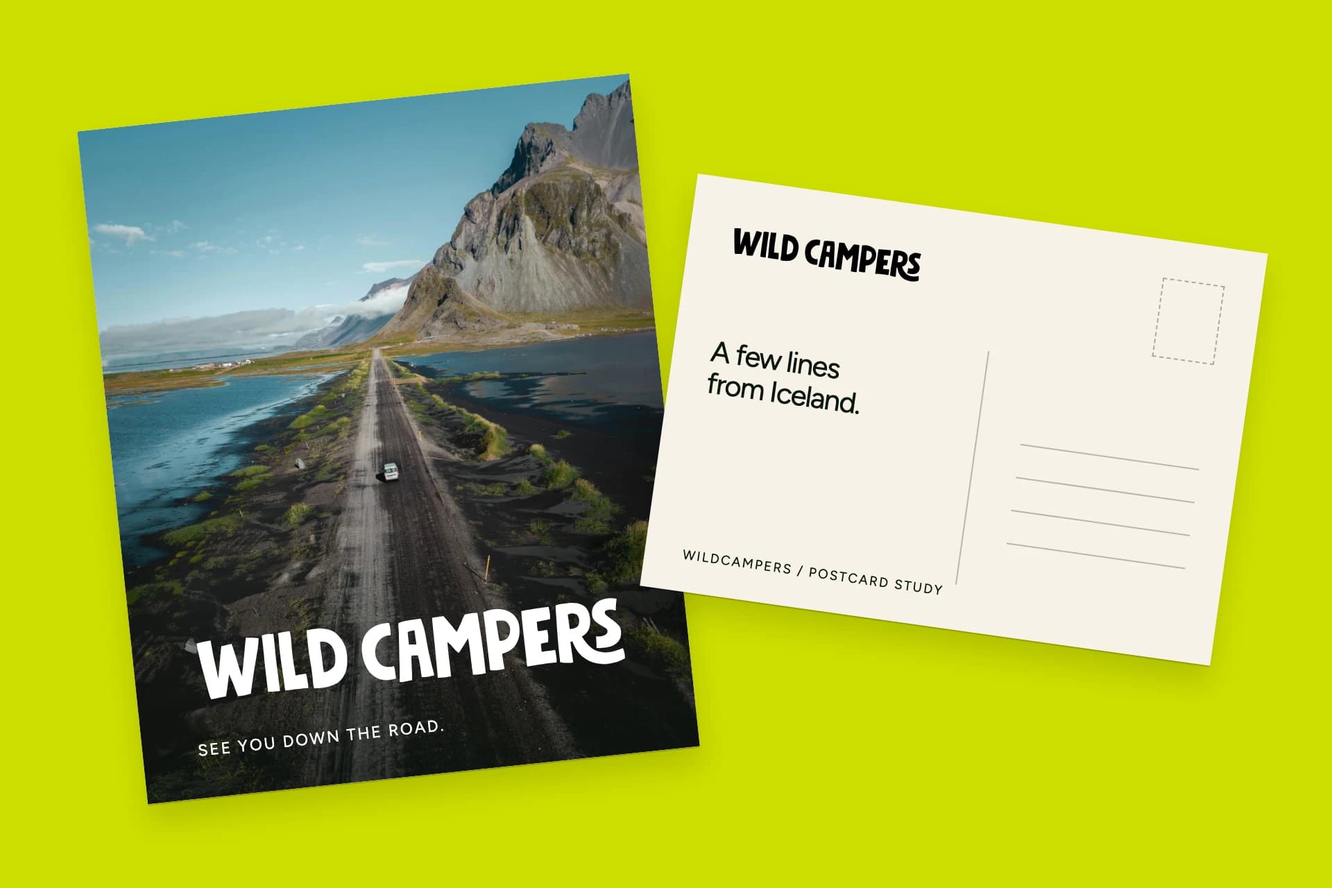
A few lines from Iceland.
Postcards were part of the original project idea: something travellers could send or keep. The new front-and-back study pairs a road photograph with a clear message space, bringing the later logo system into that original format.
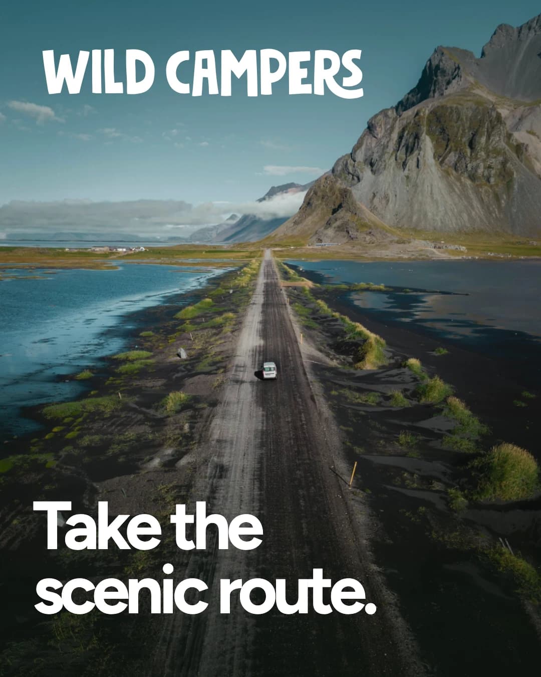
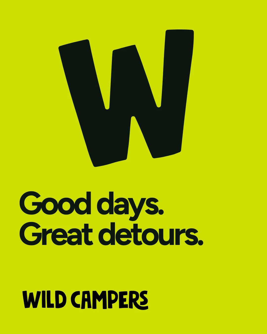
The same character, out in the world.
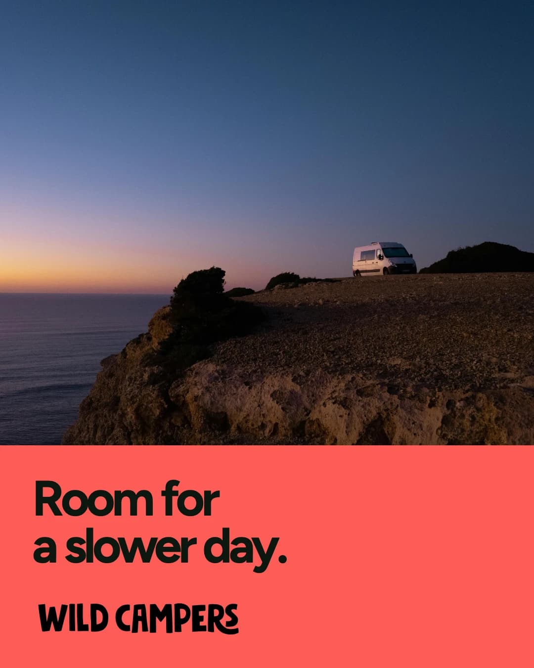
A photograph, a short line and a confident mark form a compact campaign system. The layouts alternate between open-road imagery, the oversized W and slower camper moments, keeping the message direct and the visual character consistent.
Nordic Travel Group
Traveler materials · Brand identity · 2022