Brand identity · A journey through Iceland
Nordic Car Rental
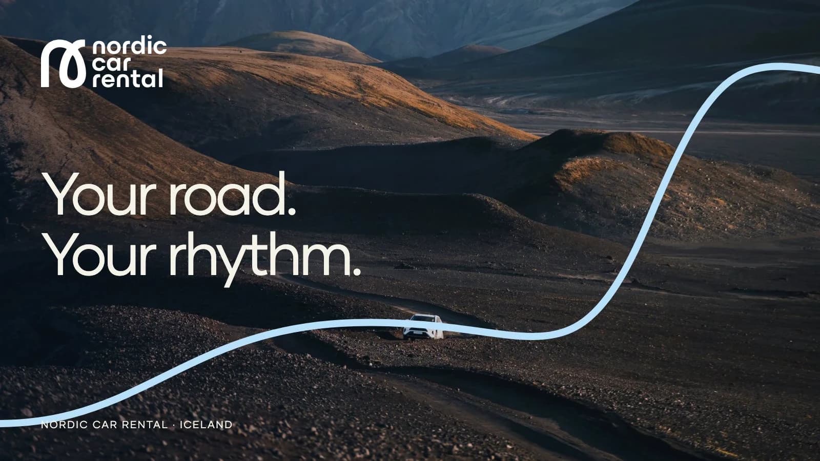
A familiar presence on unfamiliar roads.
- Services
- Brand IdentityArt DirectionSocial & Campaign DesignMotion DesignBrand Applications
- Industry
- Car rental
- Year
- 2025
Challenge
An Icelandic road trip starts long before the keys change hands. Travelers are choosing a vehicle, imagining their route and trying to understand a place they have never driven before.
Nordic Car Rental needed a visual language that could carry both the excitement of the journey and the reassurance of a dependable local service.
Approach
The identity brings together a distinctive curved mark, midnight navy, ice blue and photography that puts the traveler inside the landscape. A flowing route line connects the individual touchpoints.
The presentation follows that language from the brand guide into social design, then into motion and proposed travel essentials. Each application has its own job, with one recognizable identity throughout.
A car rental identity with somewhere to go
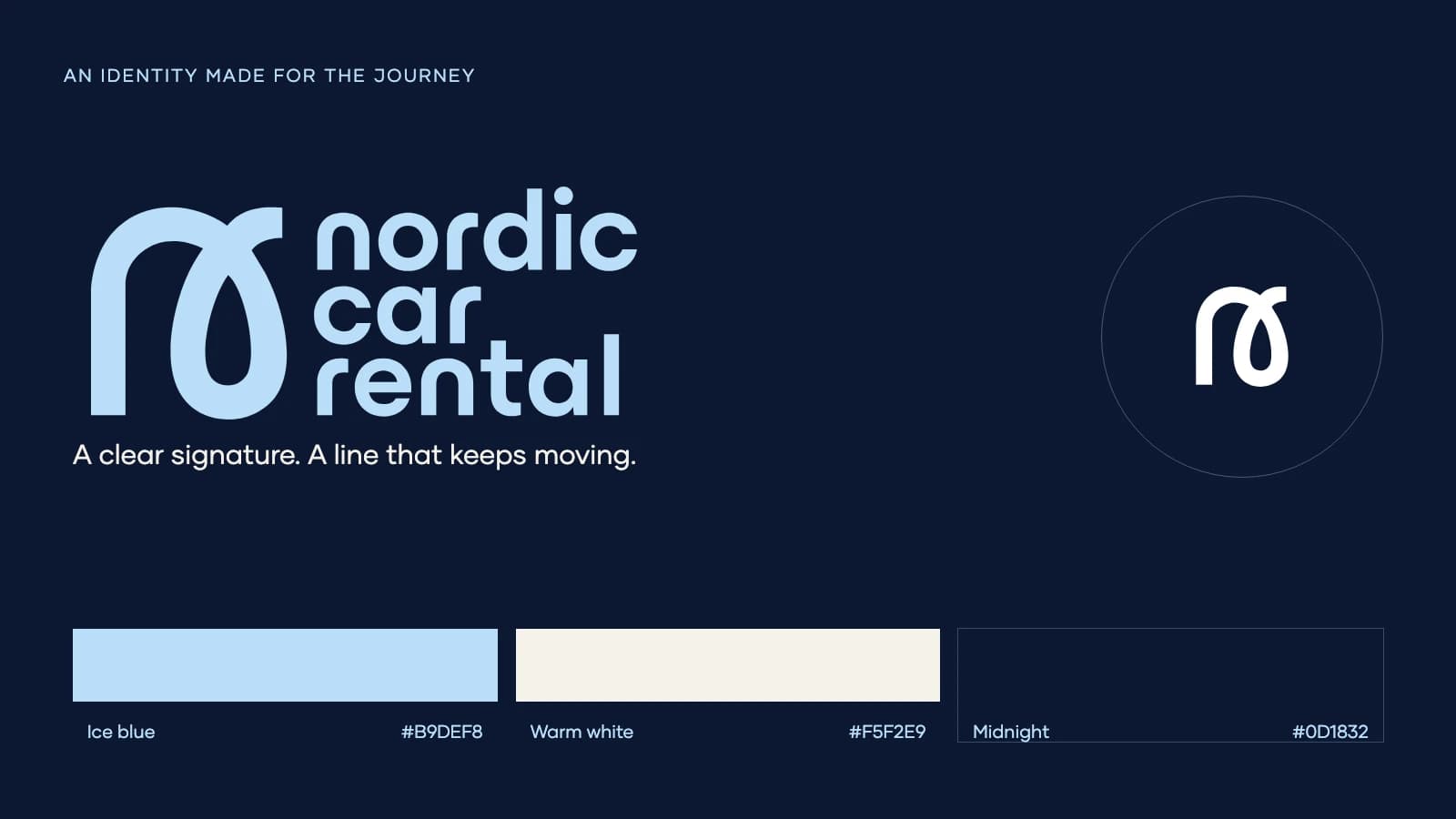
The Wander Agency’s brand identity work for Nordic Car Rental connects logo design, photographic art direction and campaign graphics around Icelandic road travel. The compact symbol and stacked wordmark share the same rounded character. Navy gives the system weight; ice blue brings lightness; warm white leaves room for the content.
The details behind the consistency
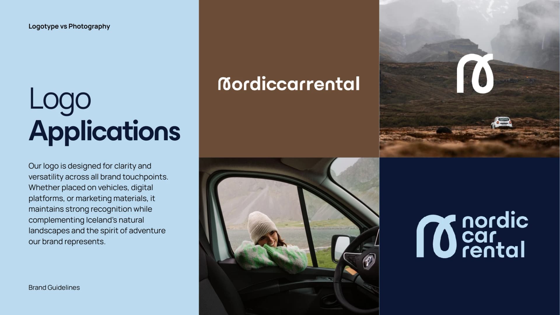
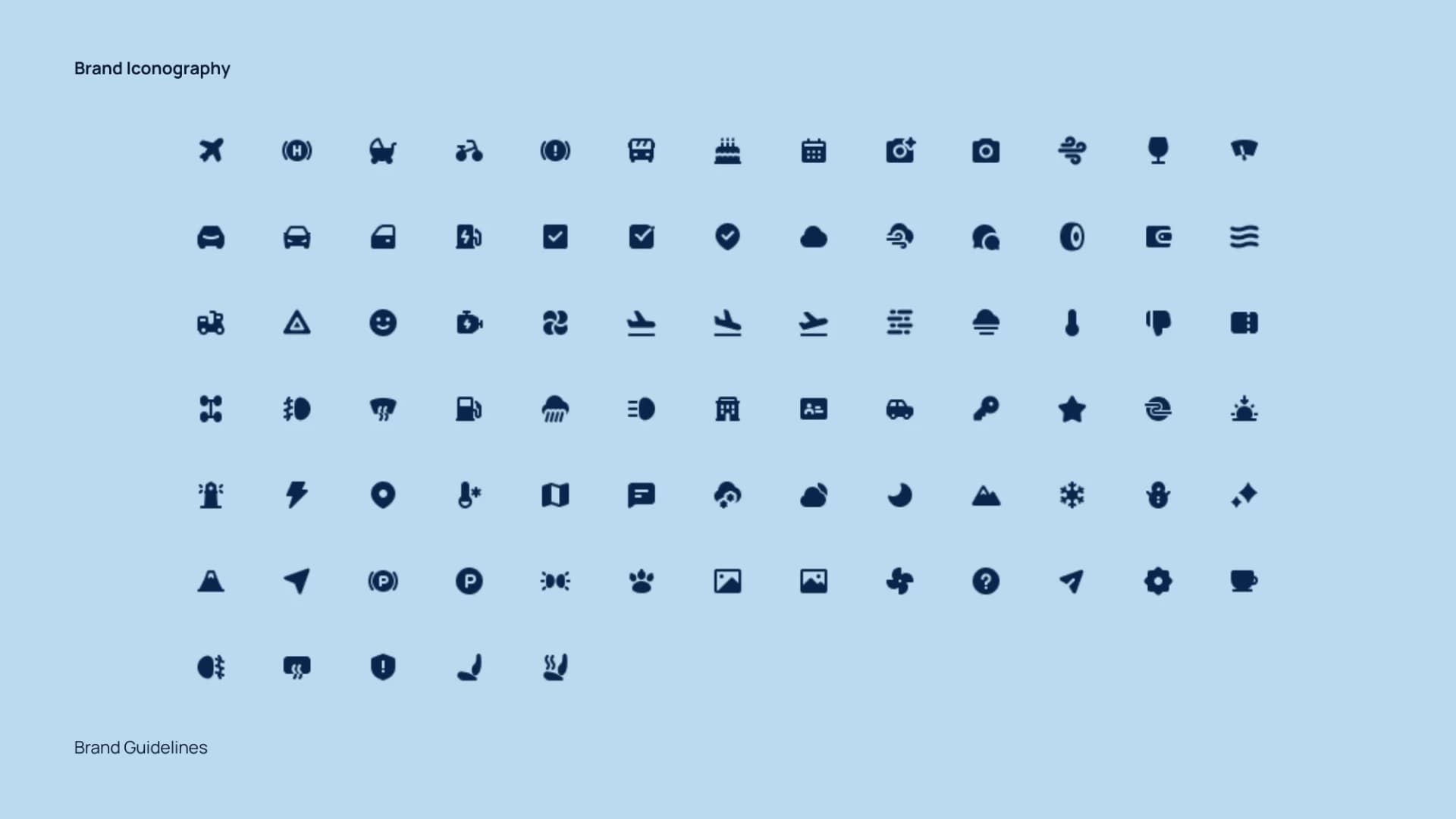
Logo placement, image direction and a broad icon vocabulary give the identity enough range to work at very different scales.
These original guide pages show how the system was defined before being extended into individual applications.
The journey is the point
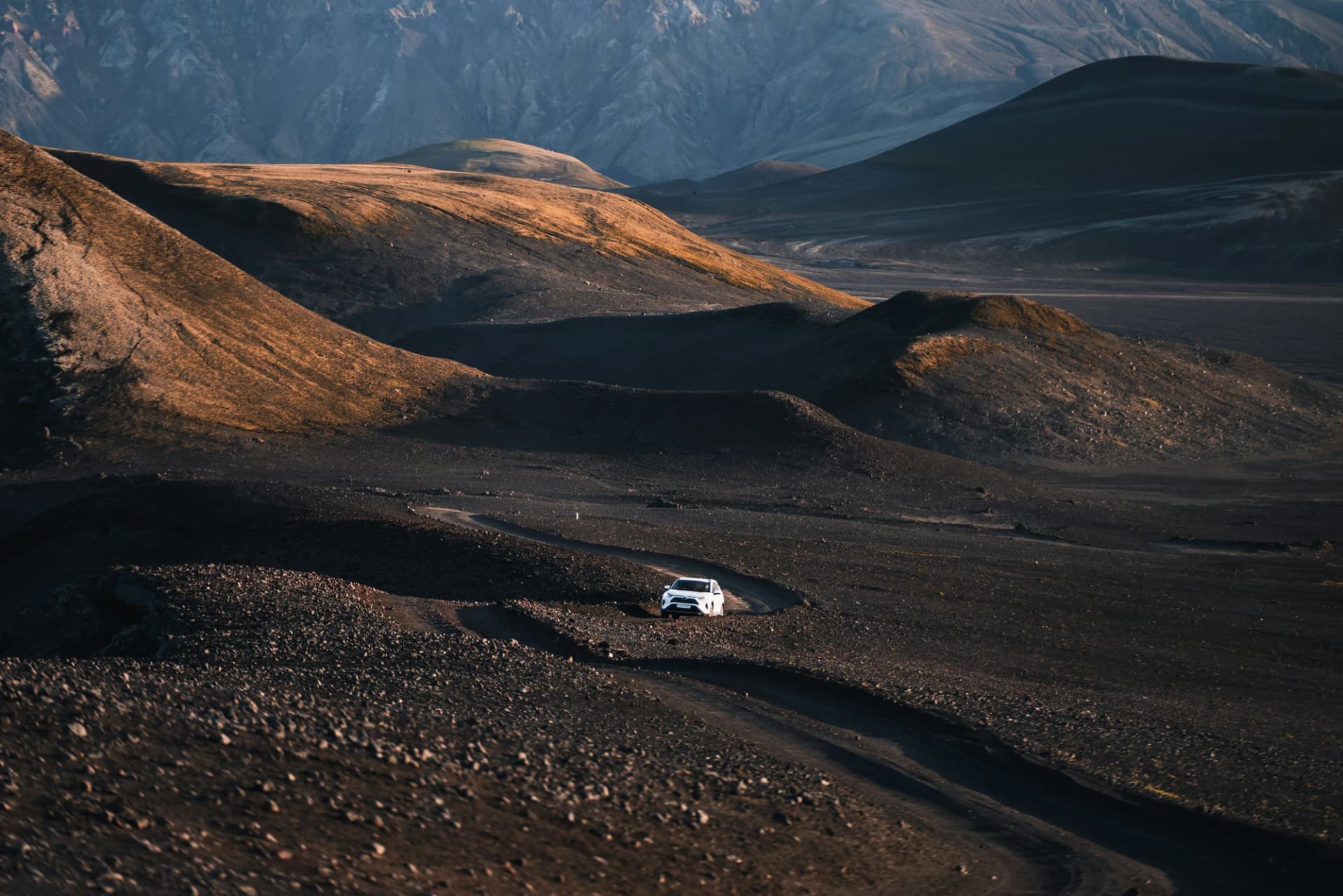
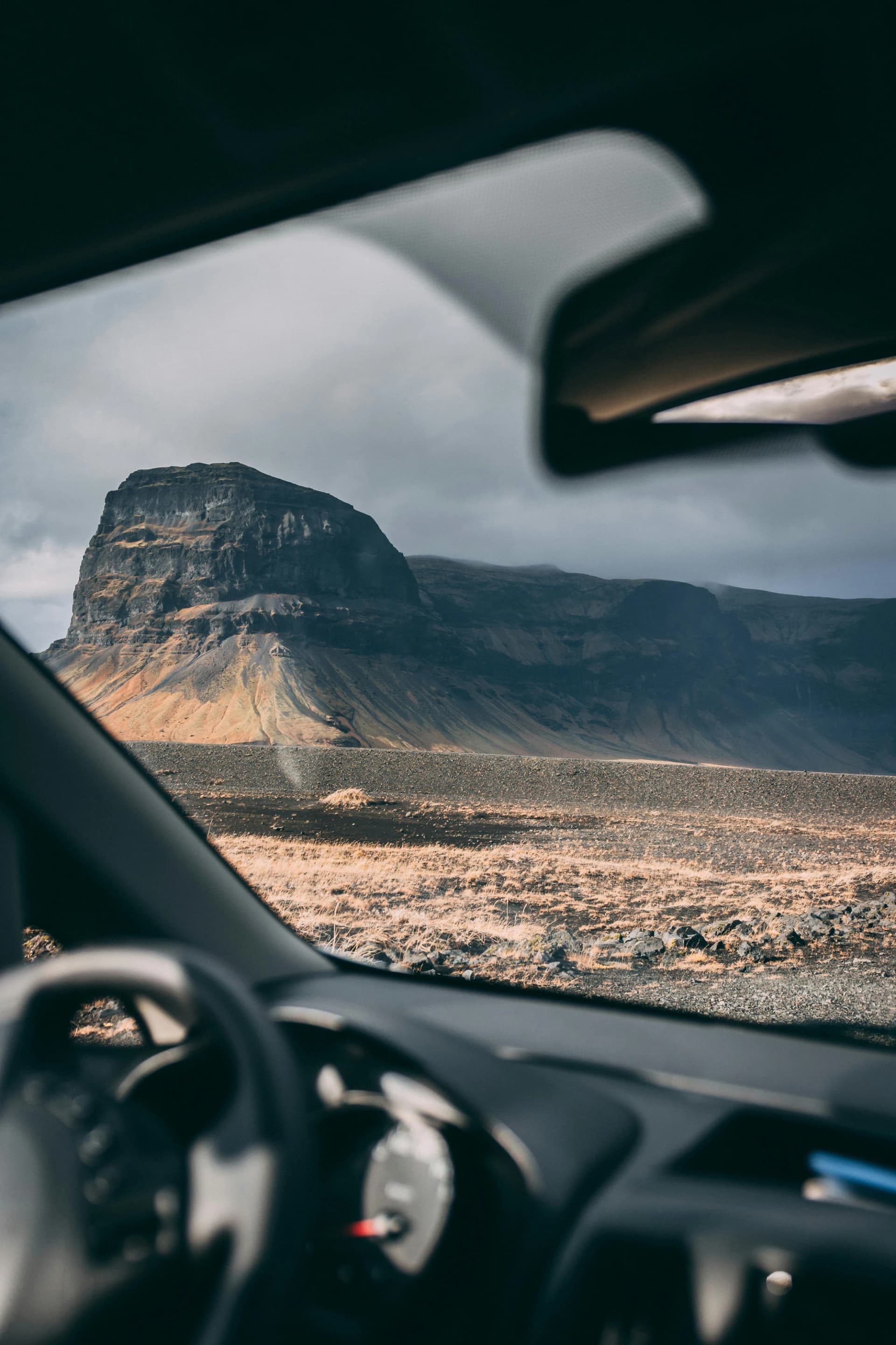
Wide landscapes establish the scale of Iceland. A view through the car window brings it back to a human perspective.
The selected photography keeps the vehicle part of the experience, with the road and the place always in view.
One line. Many ways forward.
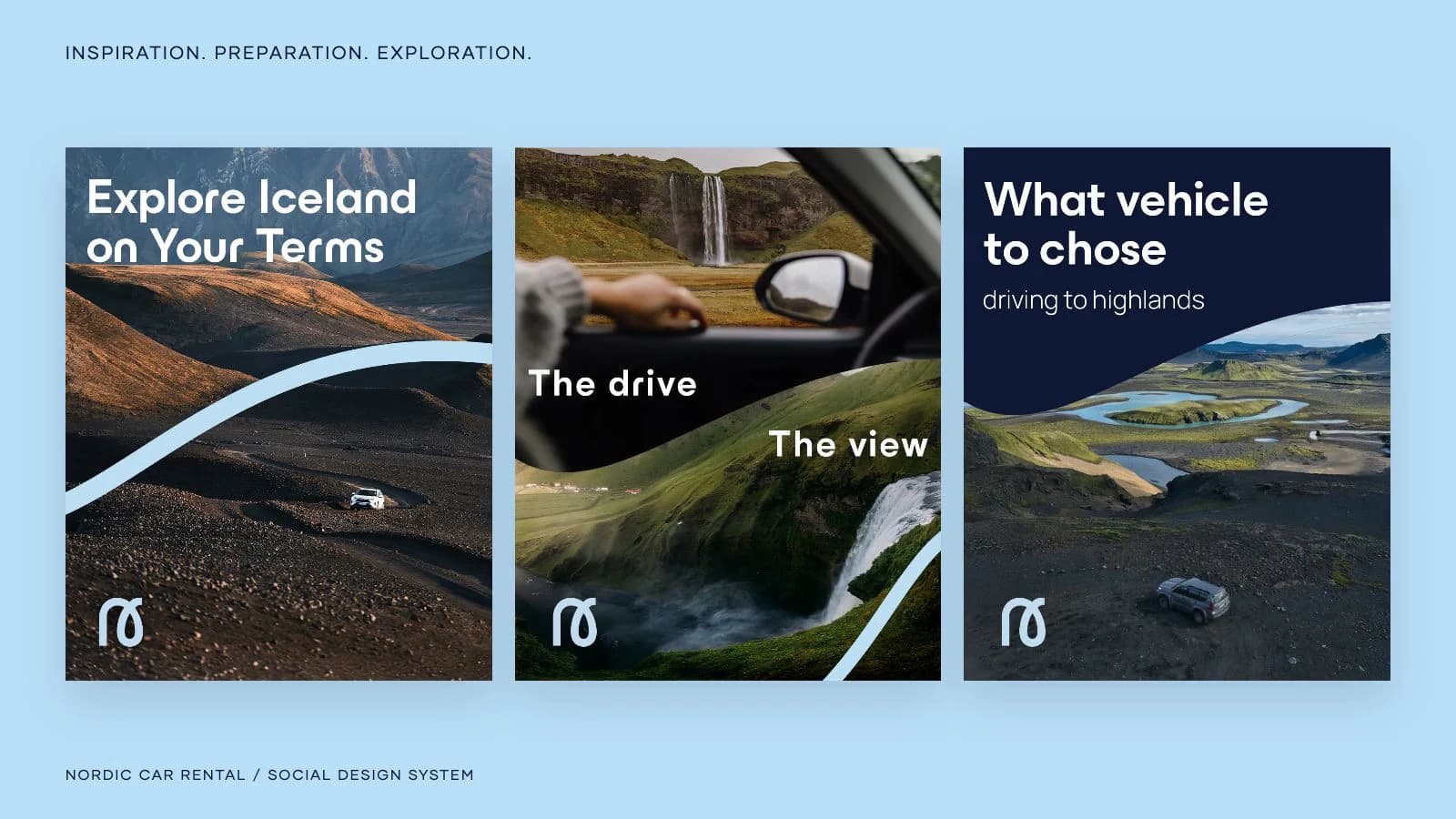
The route curve travels through photographs, crosses a carousel and wraps around everyday objects. It makes the work recognizable without forcing every composition into the same template.
A feed with a sense of direction
A short motion study brings the supplied campaign designs together: destination inspiration, vehicle guidance and an aurora carousel connected by the same pale-blue line. The campaign system gives a car rental marketing team room to move between practical information and travel stories, with a recognisable link between a single post, a carousel and a film.
Recognizable before the first journey
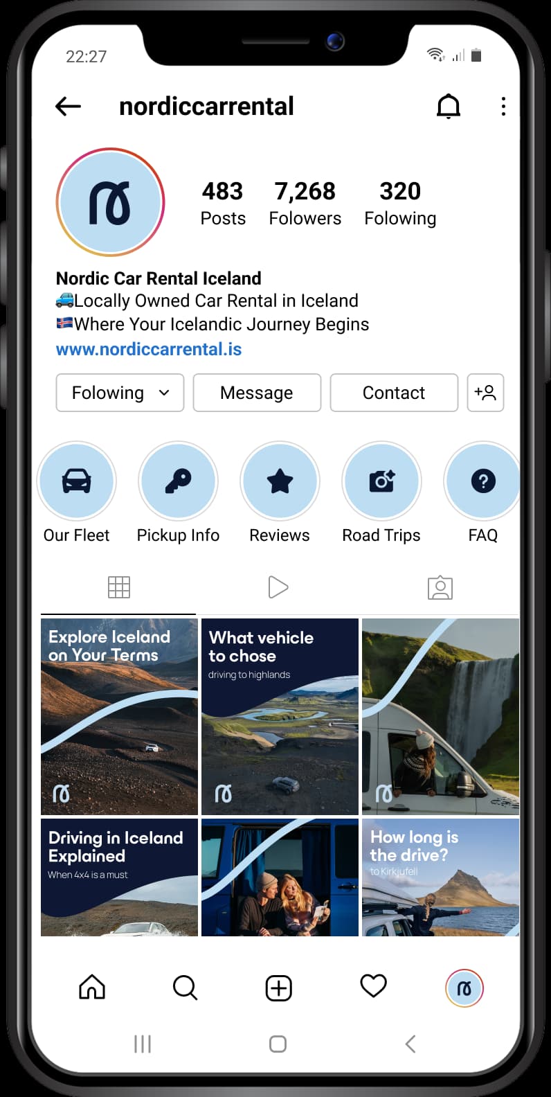
The profile brings the identity into a consistent social presence, from the illustrated highlights to the rhythm of the feed.
The same palette, route line and photographic direction connect the individual stories into one brand.
An identity you can take with you
A proposed road-trip kit translates the system into canvas, coated metal and silicone. The tote carries the route line at scale; the flask and key tag use the compact symbol.
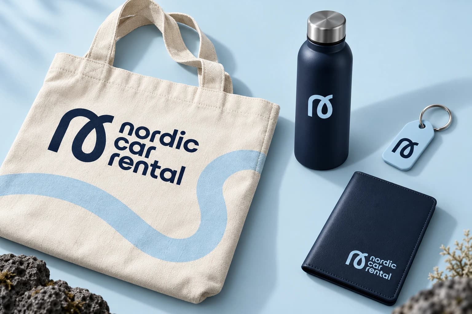
A good trip starts here
The proposed folder, welcome cards and travel journal carry the same care into the handover. A restrained palette, tactile stock and a few clear words make the first physical encounter feel considered.
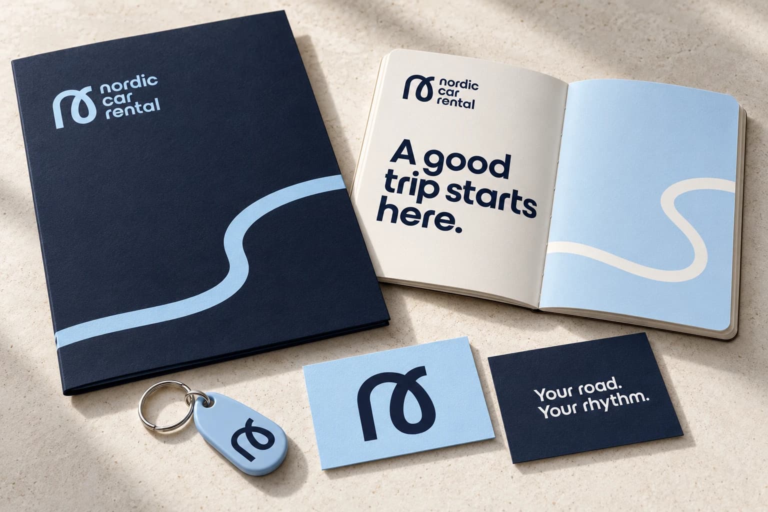
One identity, from first impression to departure
A connected body of work across identity, communication and proposed physical applications.
- 01
Identity and guidance
Logo variants, a consistent palette, photographic direction and a travel icon vocabulary.
- 02
Social and campaigns
Profile architecture, practical posts and connected carousels.
- 03
Motion language
A brand film and campaign sequence built around the route curve, image reveals and deliberate pacing.
- 04
Physical applications
Merchandise and pickup stationery concepts that extend the brand into the journey.
The Iceland Tour Co.
Private journeys · Identity & digital · 2025