Private journeys · Identity & digital
The Iceland Tour Co.
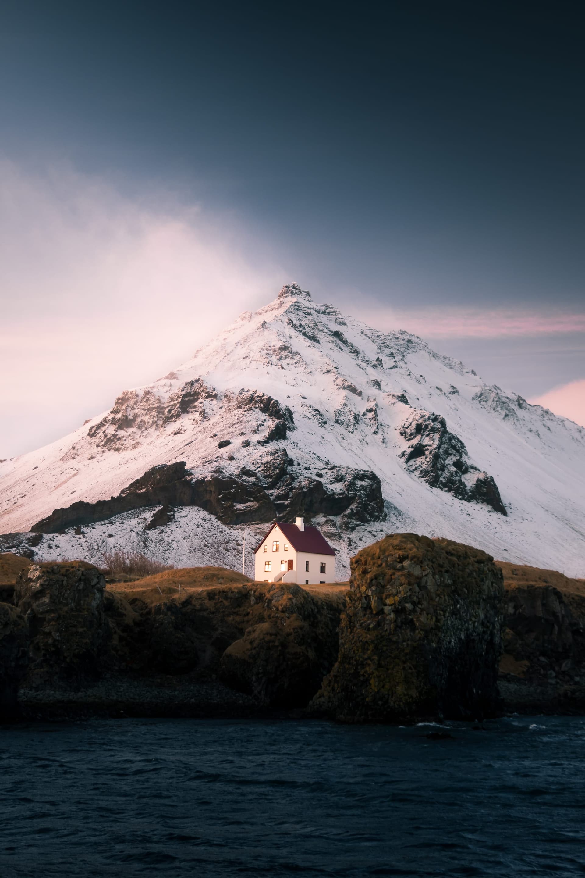
A considered identity for seeing Iceland at your own pace.
- Services
- Brand IdentityBrand GuidelinesTone of VoiceArt DirectionDigital Design
- Industry
- Private tours
- Year
- 2025
Challenge
For a private-tour company, the experience begins well before the first stop. The words, photographs and digital experience all need to convey the care that goes into planning the journey.
The Iceland Tour Co. needed a recognizable identity that could hold the scale of the landscape and the intimacy of a personal itinerary. It also needed clear guidance for keeping that character consistent across tour discovery, detailed itineraries and campaigns.
Approach
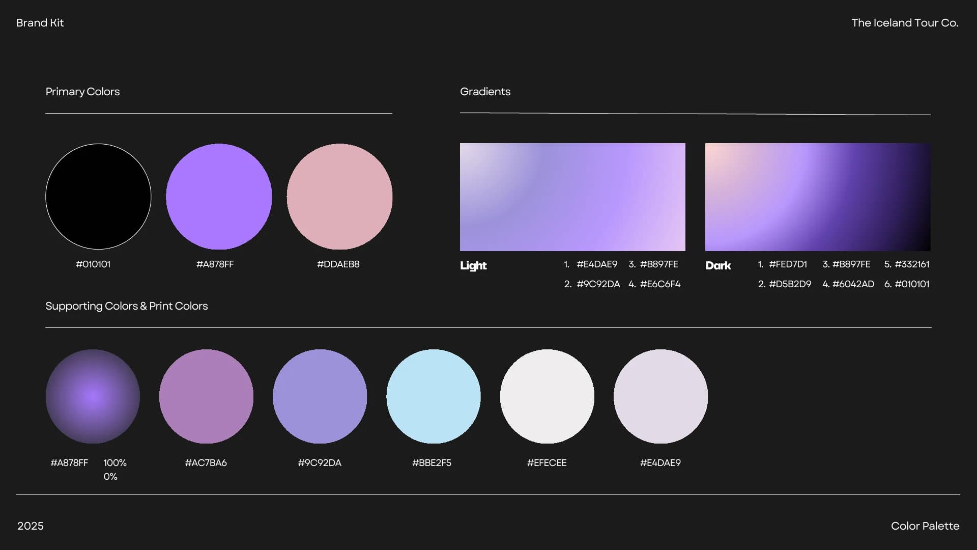
The Wander Agency’s branding work for this private tour company connects visual identity, brand guidelines, tone of voice and digital design. A travel rune forms the centre of the system: a compact, directional mark paired with a clear two-line wordmark. Black gives it definition; lavender, pink and soft gradients connect it to the changing light in the photographic direction.
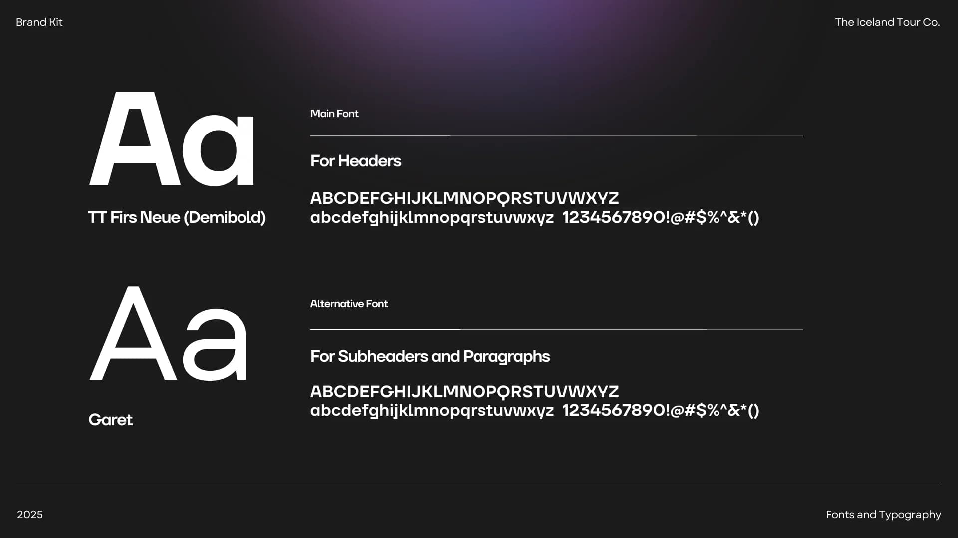
The brandbook brings the visual system and tone of voice together. TT Firs Neue Demibold leads, Garet carries supporting copy, and composed photography leaves room for the place itself. The same principles connect destination storytelling with practical decisions: choosing a route, exploring an itinerary or personalizing a product. Current website captures show the identity in use alongside the 2025 design archive.
A sense of direction
The landscape sets the pace. A traveller, a change in the light, a place worth pausing: the film connects those moments with the original rune, typography and color system, then follows the identity through digital experiences, campaigns and physical applications.
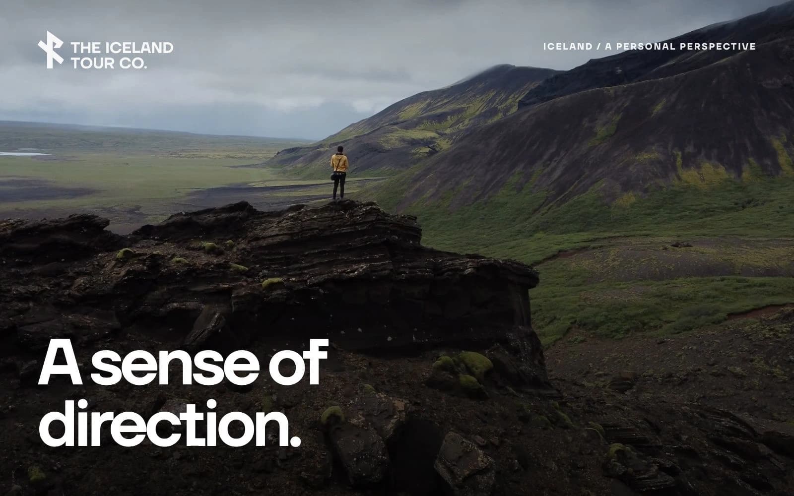
Changing light. A consistent voice.
Lavender, muted pink and black form the primary palette. Pale lilac and blue support the system, while gradients bring the colors together. TT Firs Neue Demibold and Garet establish a clear relationship between headlines and supporting information. These are the original brandbook pages.
Let Iceland set the pace.
The identity leaves space for the experience: a steady horizon, a change in the light, a moment worth stopping for. Clear language gives that atmosphere a practical purpose.
A place to pause
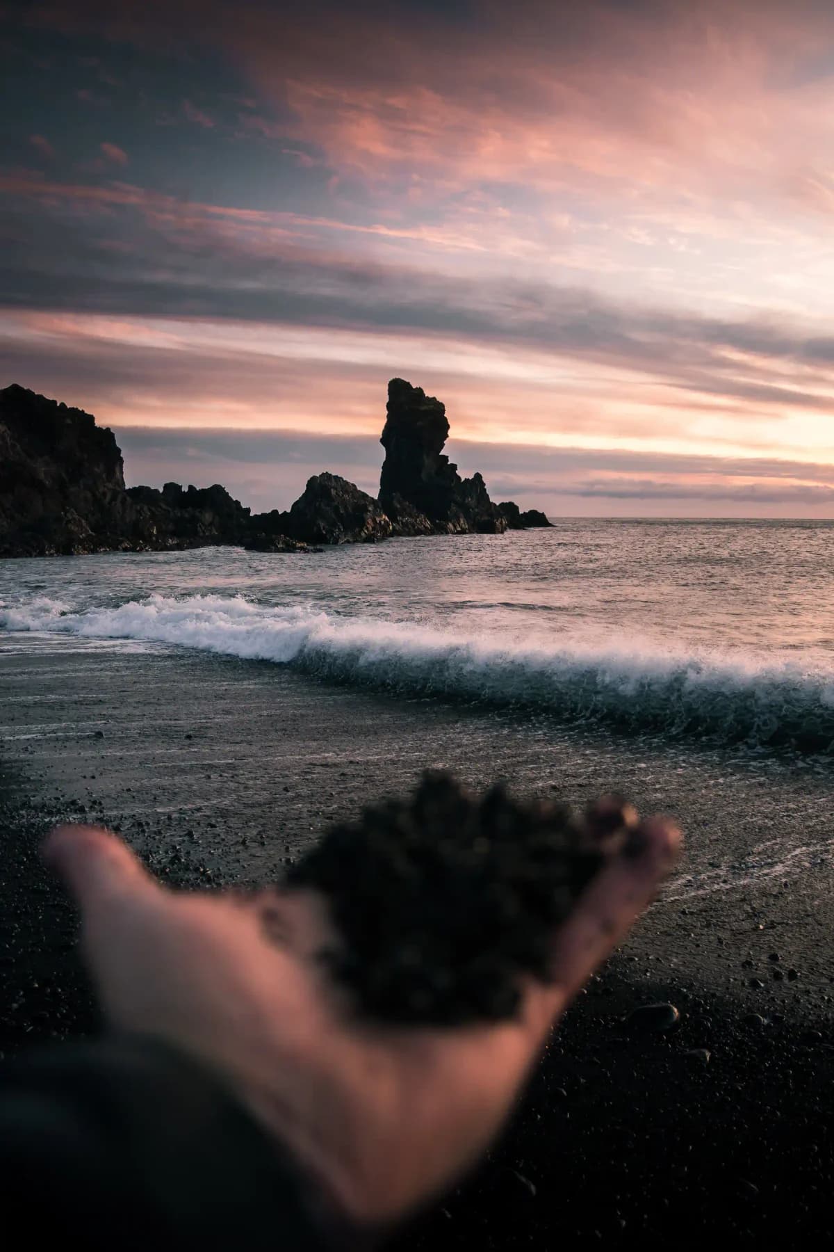
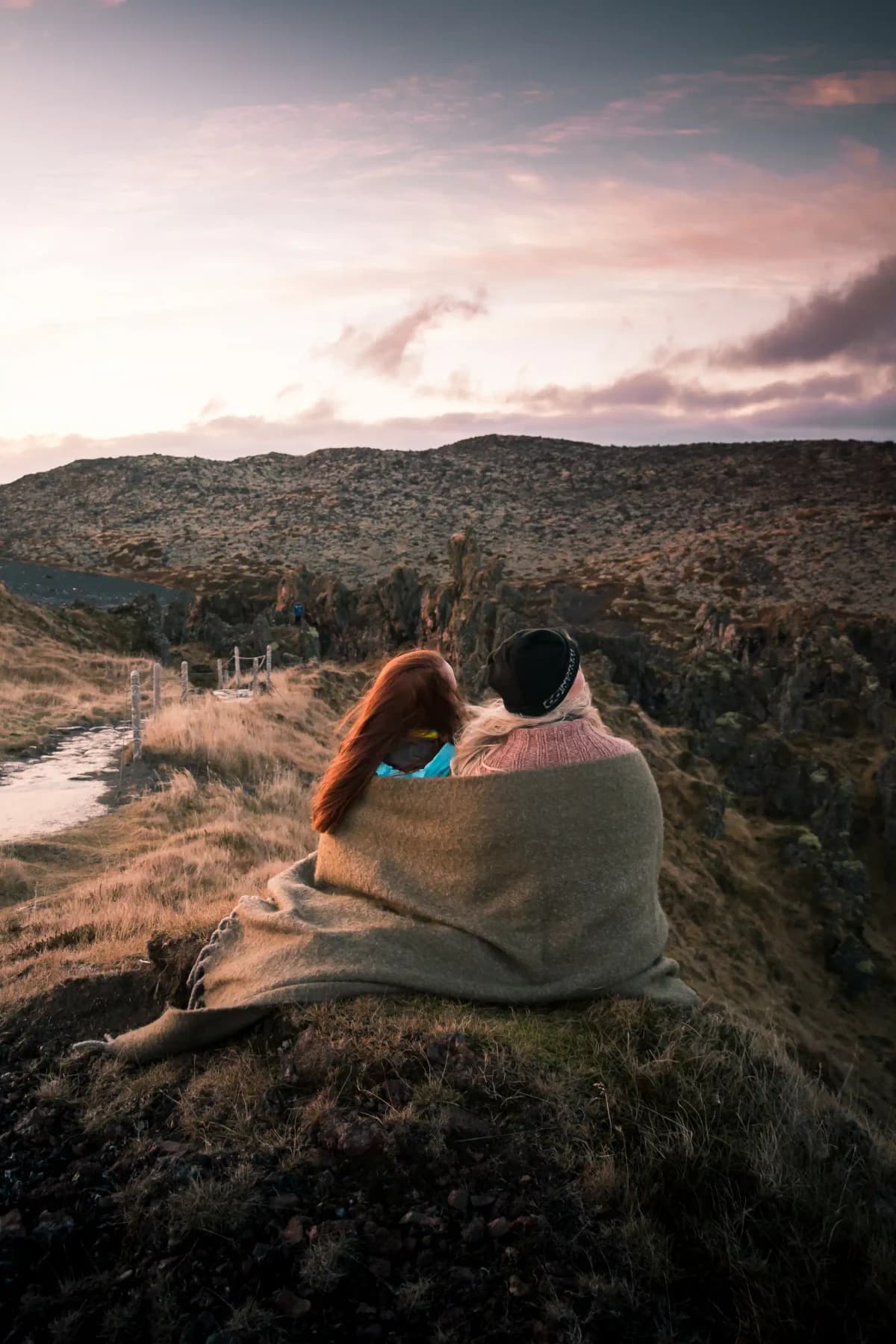
The image direction favors spacious compositions, natural light and people who belong within the landscape. Coastline and human presence sit together here as two views from the website image library: one establishes the setting, the other gives it a personal scale.
Give the journey a shape
Photography opens the journey; interaction gives it shape. The private-tour hero becomes a gallery, the itinerary unfolds around the day’s stops, and date selection brings a personal trip closer. An editorial motion study connects those moments across desktop and mobile.
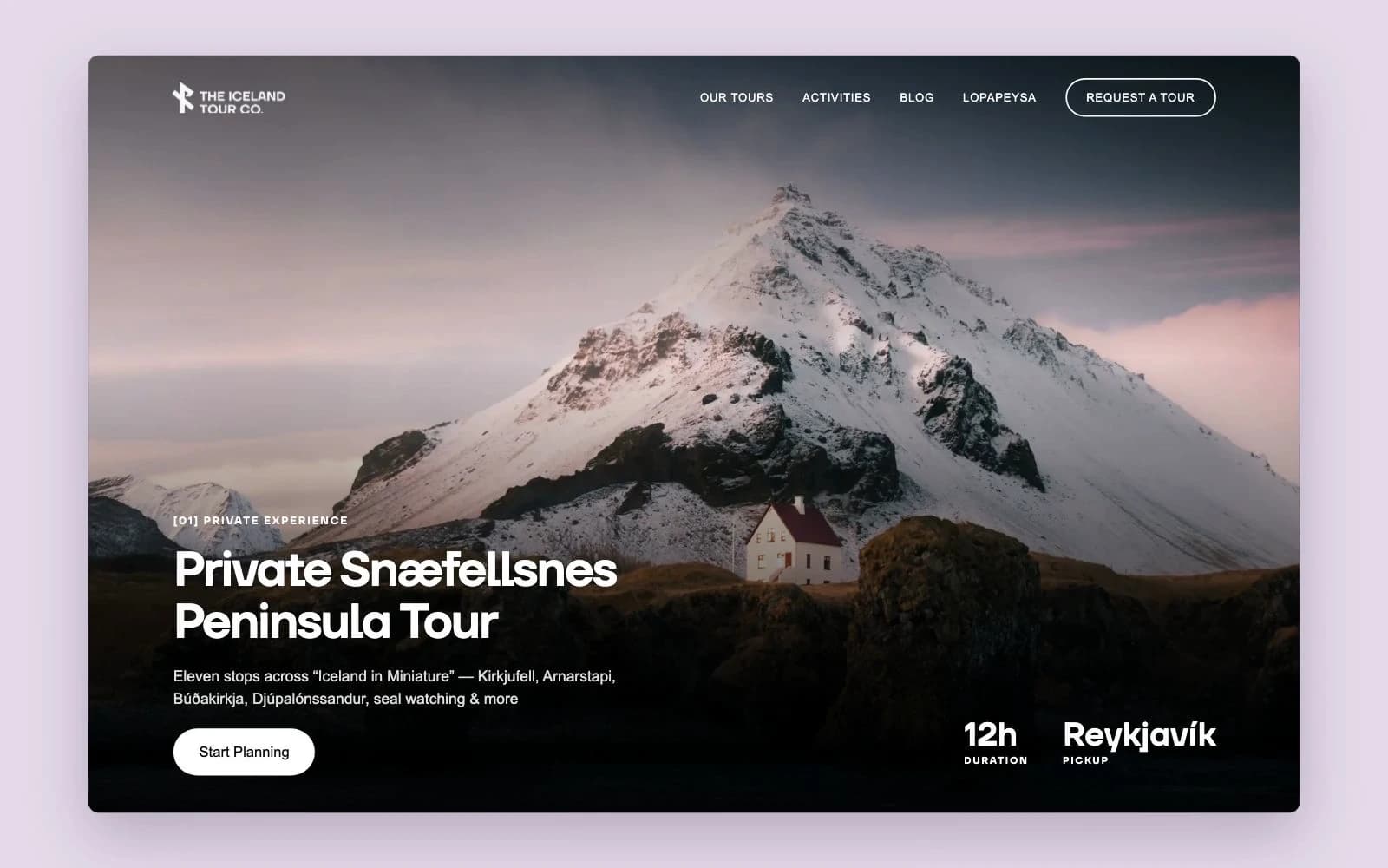
Explore the place. Make it personal.
On a smaller screen, the landscape stays close. The private-tour gallery invites exploration, while the Lopapeysa builder lets visitors shape an Icelandic sweater through color. Two different interactions share the same quiet typography, generous imagery and lavender accents.
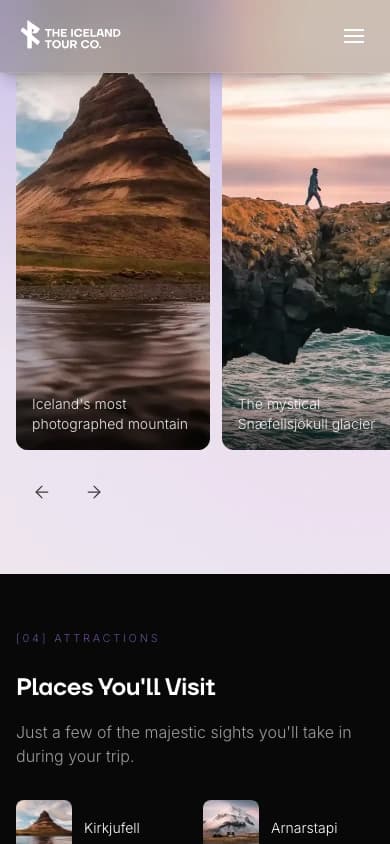
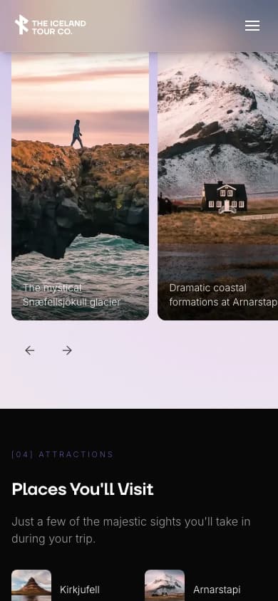
Gallery · first view
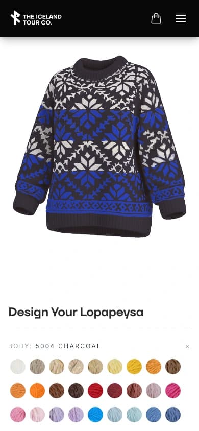
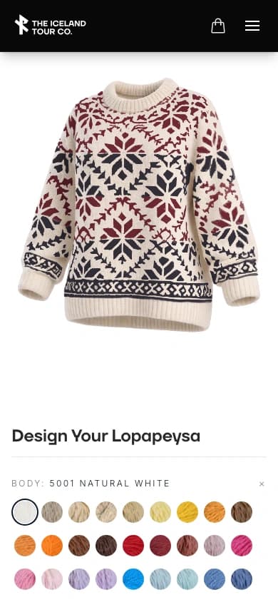
Charcoal / royal blue · live builder
An identity people can interact with
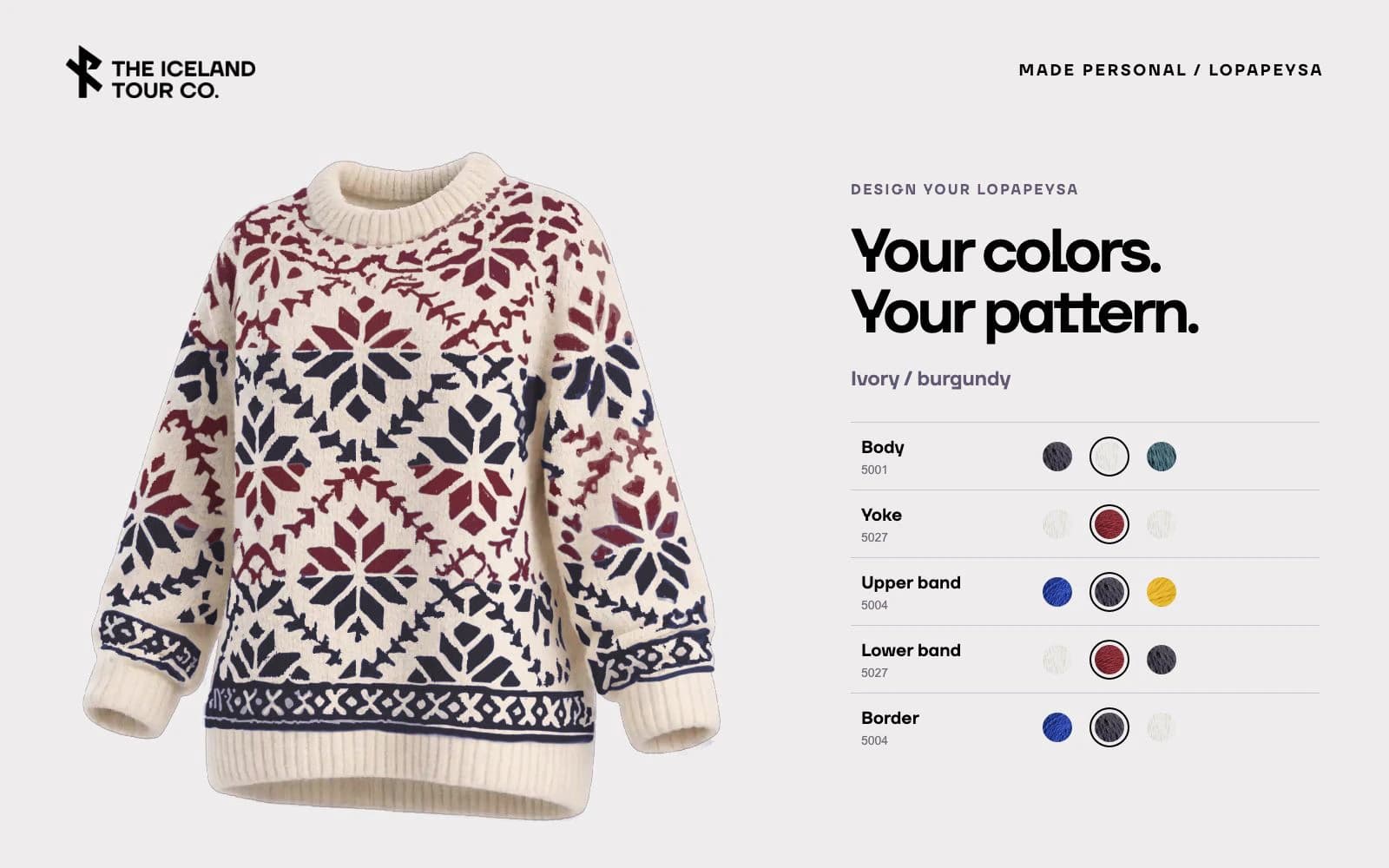
The Lopapeysa configurator makes every part of the pattern personal. Body, yoke, upper band, lower band and border change independently, moving through charcoal and royal blue, ivory and burgundy, and teal and gold. Original knitted textures keep the result tangible as each yarn selection takes shape.
From a first impression to something you carry
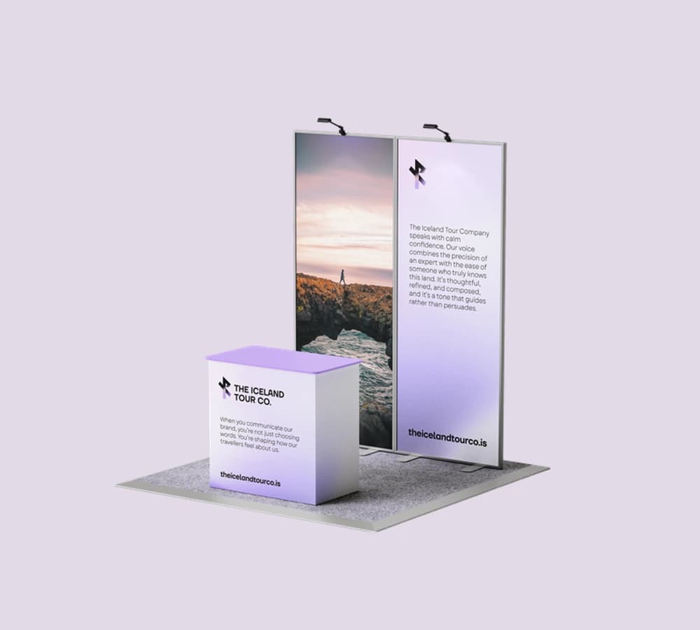
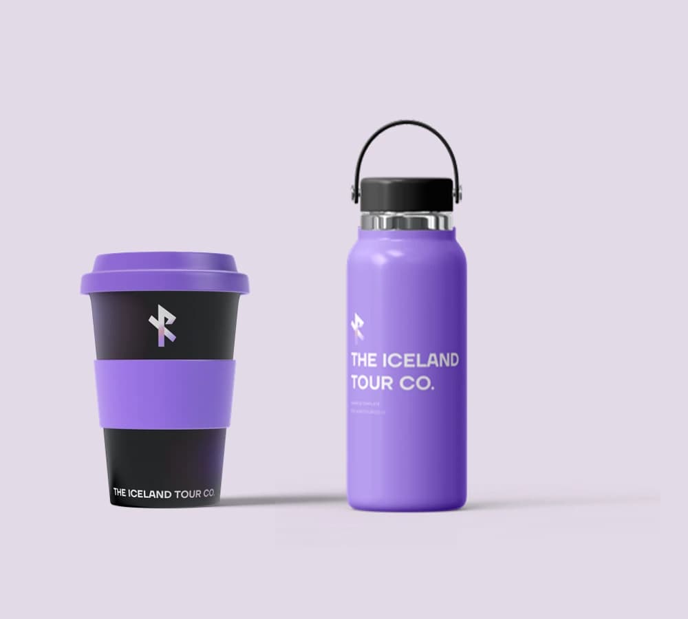
The identity moves into physical space through an exhibition display, then onto everyday objects through a lavender bottle and cup. The same rune, typography and color hold the two scales together.
These original brandbook studies show the proposed application of the identity.
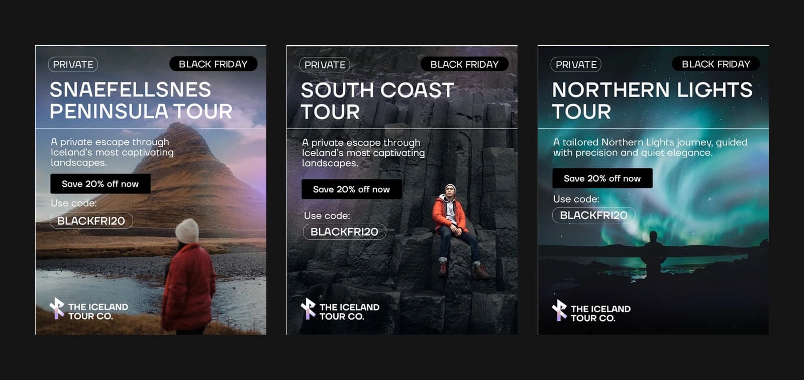
Different destinations. The same invitation.
Snæfellsnes, the South Coast and the Northern Lights each bring a different atmosphere. A shared grid, direct typography and a wash of lavender connect the campaign family while leaving the photography room to lead.
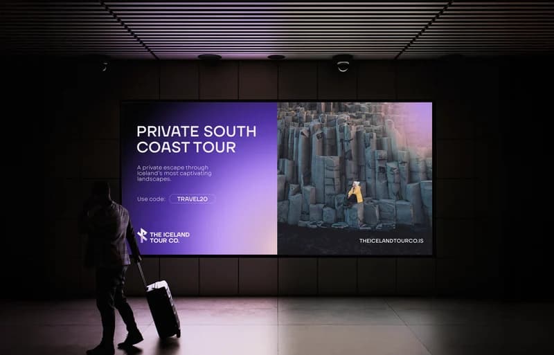
The same signature, at another scale
The brandbook’s outdoor study pairs a lavender message panel with the geometry of Iceland’s basalt columns. A short headline and the travel rune give the composition structure, while photography carries the sense of place.
This is an application study from the original brandbook. It is shown as a design proposal, with no claim that the placement ran.
One identity across the experience
For a private tour operator, the website needs to introduce a place and help someone describe the journey they want. The Iceland Tour Co. case study connects that brief to brand voice, itinerary design and enquiry interactions. The 2025 identity archive and current product examples show how the same character carries across those different decisions.
- 01
Travel rune & wordmark
A directional signature with monochrome and gradient variations.
- 02
Color & typography
A documented lavender, pink and black palette, paired with TT Firs Neue and Garet.
- 03
Voice & photographic direction
Clear, reassuring language and composed images that give Iceland room to speak.
- 04
Digital experience & campaigns
Tour discovery, detailed itineraries and product personalization, alongside the original campaign direction.
WildCampers
Icelandic camper travel · Visual identity · 2024