Brand identity · Making the complex legible
MintMine
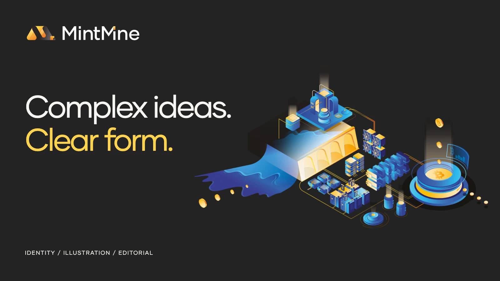
Technical ideas, given a recognizable form.
- Services
- Brand IdentityIllustrationEditorial DesignPresentation DesignMotion & Applications
- Industry
- Technology / Bitcoin mining
- Year
- 2021
Challenge
MintMine needed to connect an identity, a website concept, presentation material and a substantial technical whitepaper. The work had to make infrastructure understandable while giving very different formats a common character.
Approach
A folded mark and geometric typography anchor the identity. Amber brings warmth to the charcoal foundation; blue isometric illustrations give energy, hardware and networks a shared visual language.
This case brings the original identity and editorial work together with new motion, presentation and physical-application concepts developed from the same system.
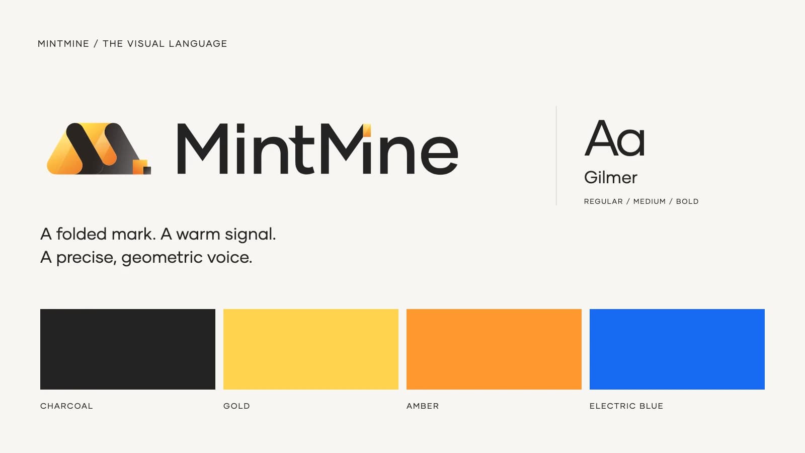
A compact mark. A distinctive vocabulary.
The folded M carries the identity at small sizes. Gilmer’s geometric forms give headlines a clear voice, while charcoal, gold, amber and electric blue connect the mark to the illustrations.
A technical story you can see
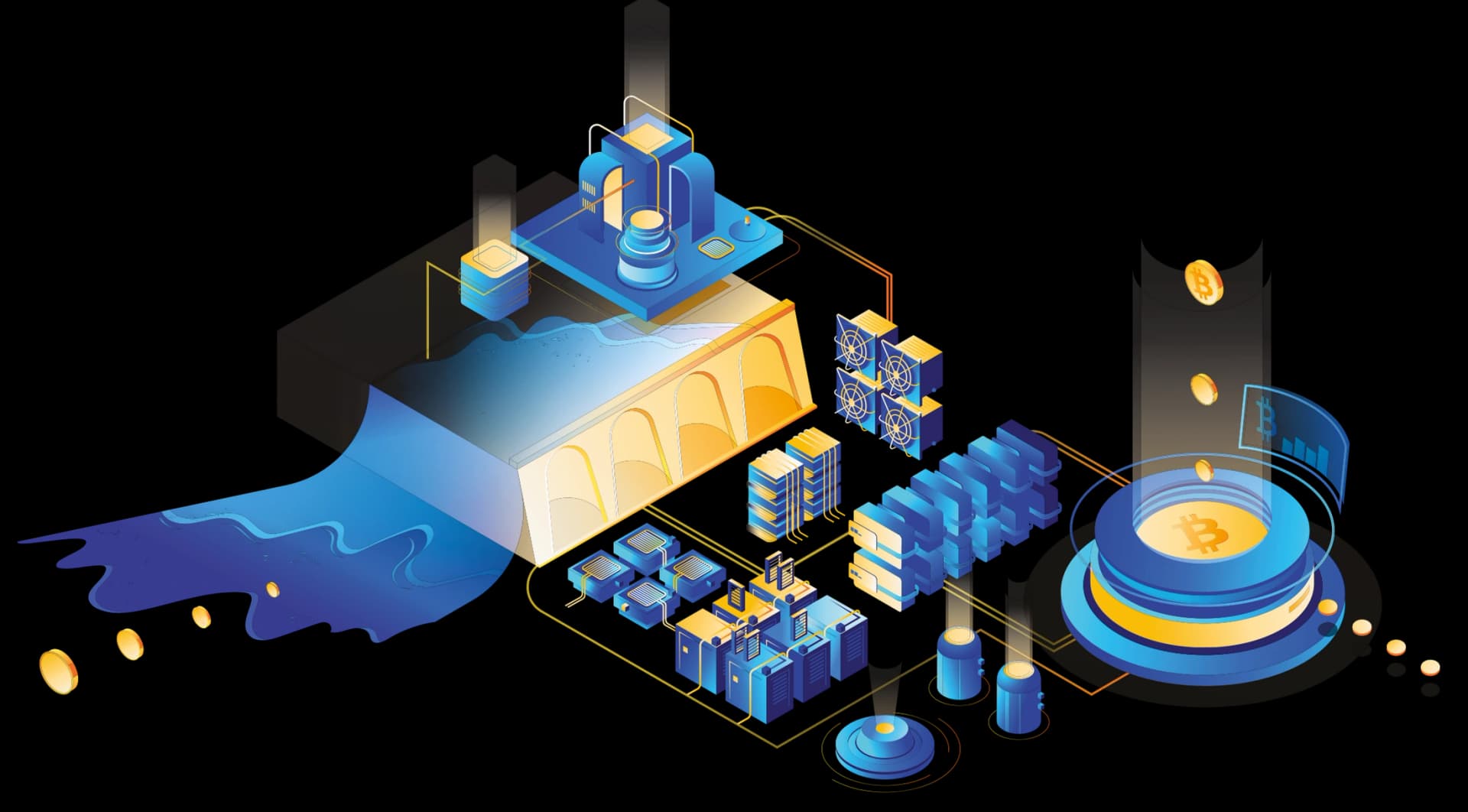
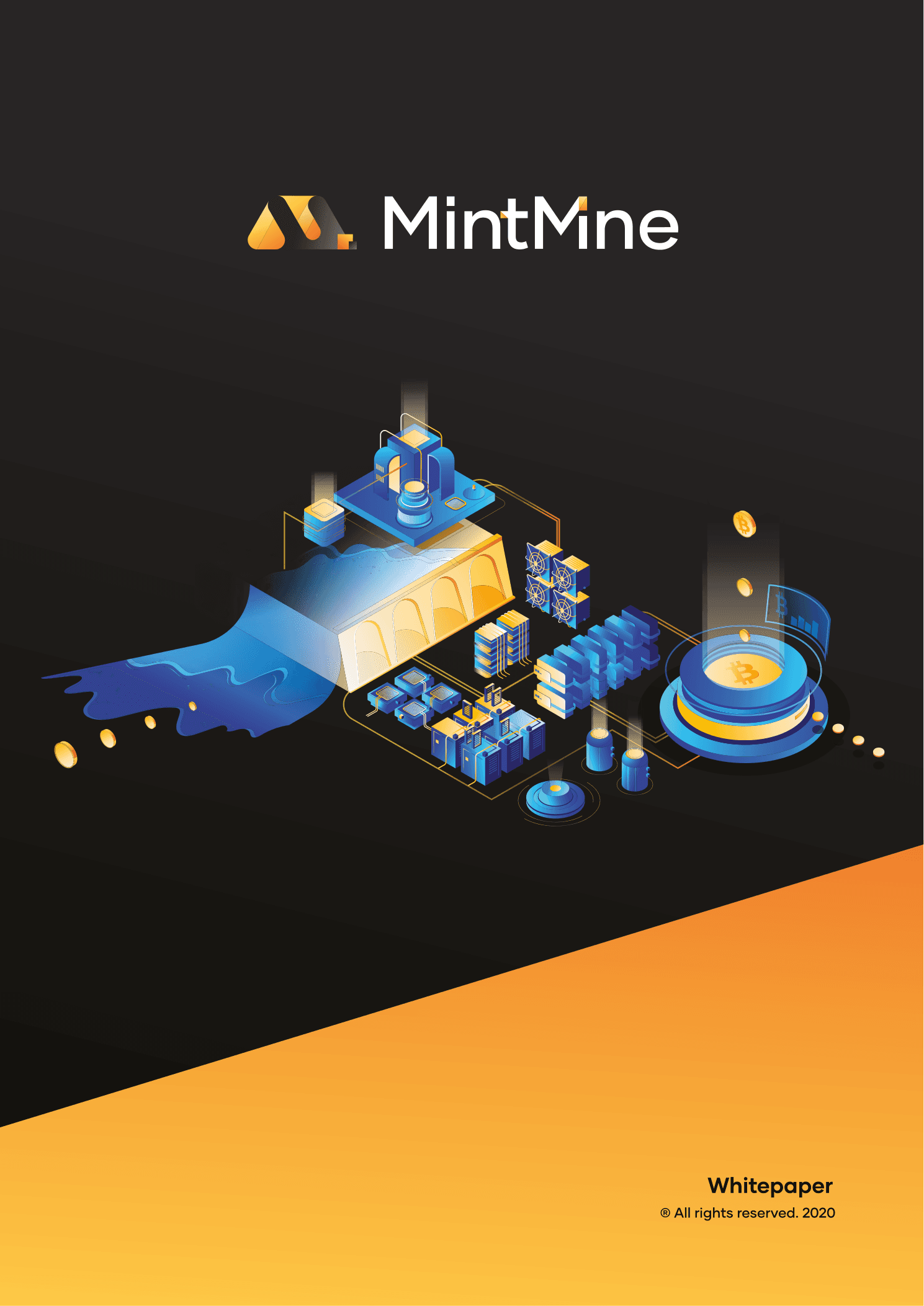
The original illustration connects hydro power, computing hardware and a network into one scene. A consistent angle, shared lighting and a limited palette let individual components work together.
From technical document to considered object
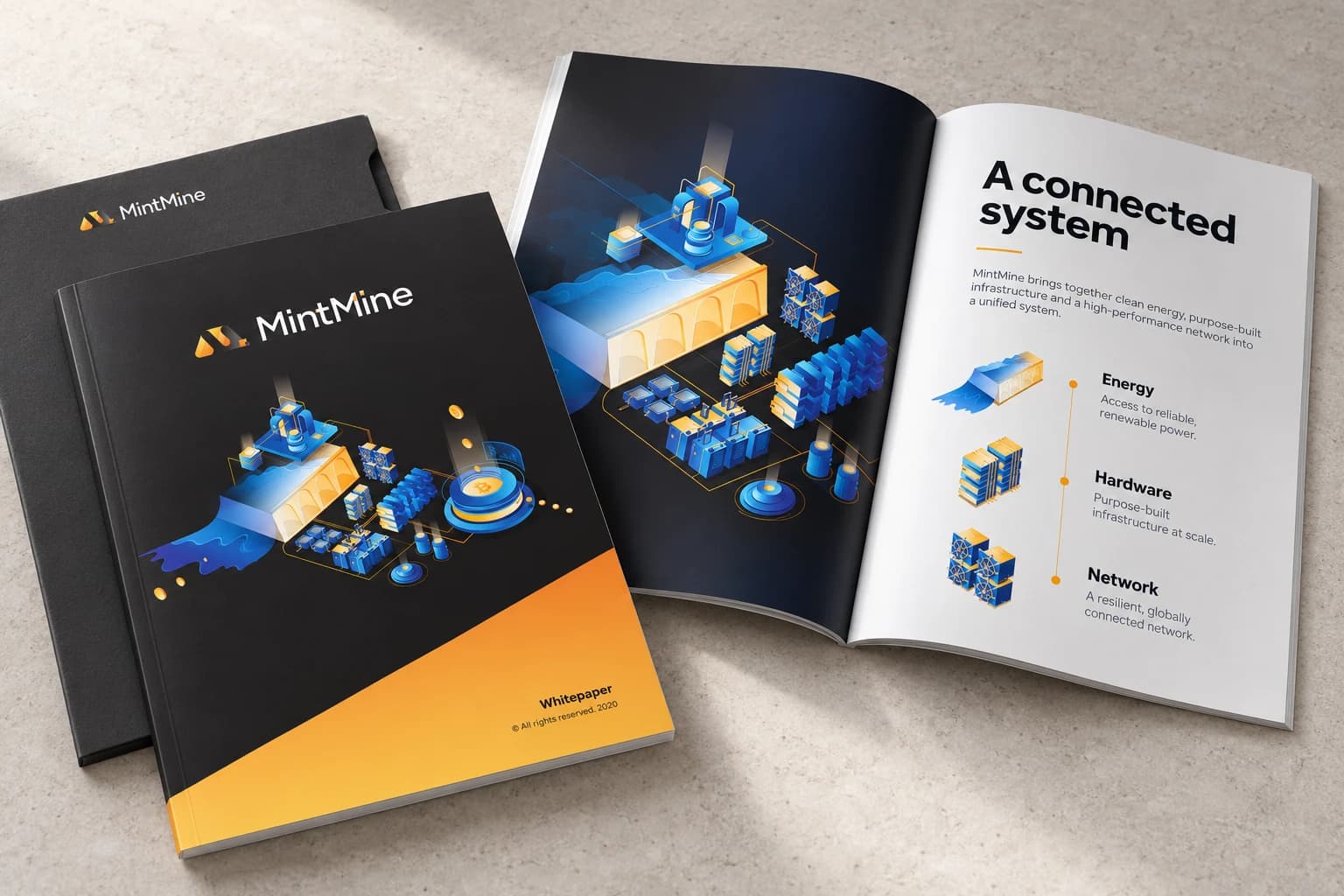
The whitepaper’s dark cover, illustrated centerpiece and amber diagonal become a tactile print presentation. The proposed open spread extends that language with a clear reading order and generous space around the diagrams.
A change of pace, built into the document
The illustrated cover introduces the subject; a bold amber divider gives the reader a clear change of section.
These are pages from the original whitepaper, whose cover is dated 2020, shown within the 2021 project archive.

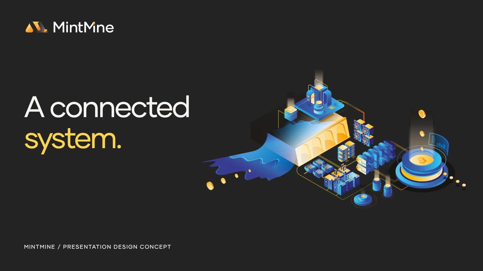
The same thinking, at presentation scale
A new three-slide study adapts the original assets into a repeatable presentation language: a strong opening, an illustrated system view and a typographic statement. Diagonal transitions echo the folded mark.
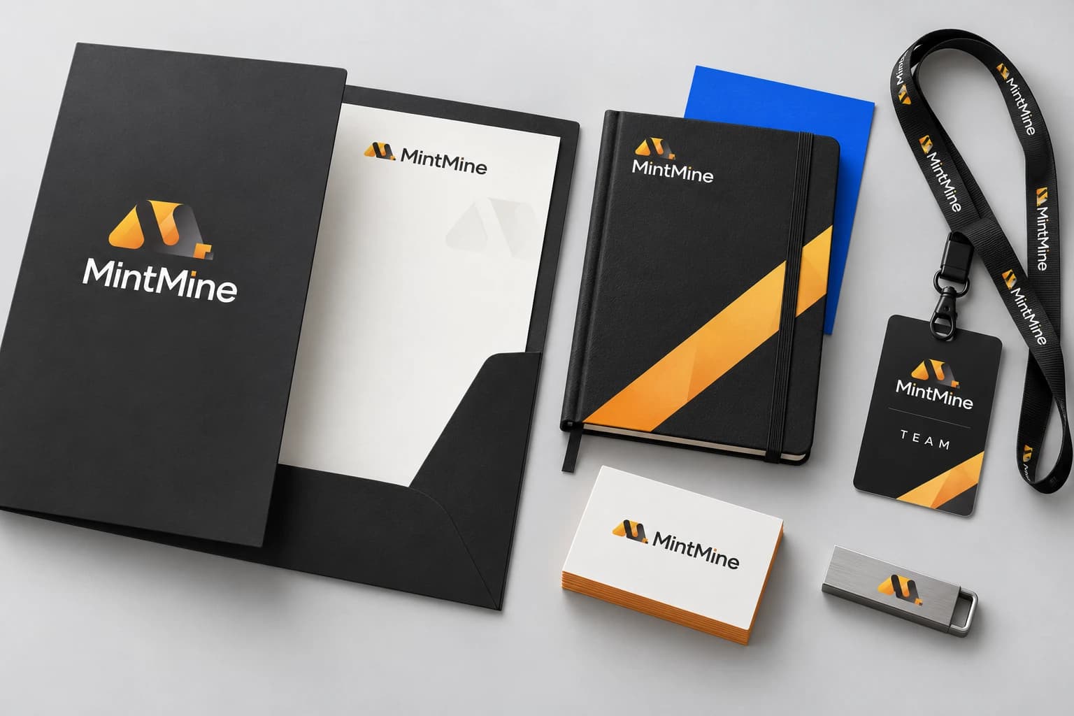
One identity, down to the details
The proposed folder, notebook, business cards, lanyard and team pass turn the identity into a coherent set of everyday materials. The diagonal ribbon gives the larger surfaces character; the original mark handles the smaller ones.
Built to hold more than a logo
The original design work and new application studies show how a small set of visual decisions can carry a much larger story.
- 01
A recognizable identity
The folded mark, geometric type and warm-to-cool palette establish the visual character.
- 02
A shared illustration language
Infrastructure, energy and hardware use the same perspective, color and level of detail.
- 03
A flexible editorial structure
Cover, chapter divider and presentation layouts give technical material a clear reading order.
- 04
A practical application system
Motion, printed materials and team essentials extend the same identity into new formats.

WeWander
Tour marketplace · Product design · 2026