Identity system · Brand design
Loomlay
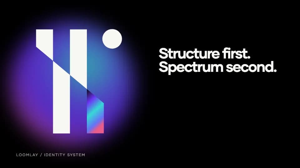
A precise identity with one controlled iridescent interruption.
- Services
- Logo DesignTypographyGradient SystemCampaign Design
- Industry
- Web3 / DeFi
- Year
- 2024
Challenge
Loomlay’s early proposition brought AI-assisted market making into an already visually saturated DeFi category. It needed an identity that felt technical and forward-looking without collapsing into familiar neon-token clichés.
The product has since evolved into a broader crypto-app discovery platform. This case study documents the earlier identity and market-making communication system rather than presenting it as the current product interface.
Approach
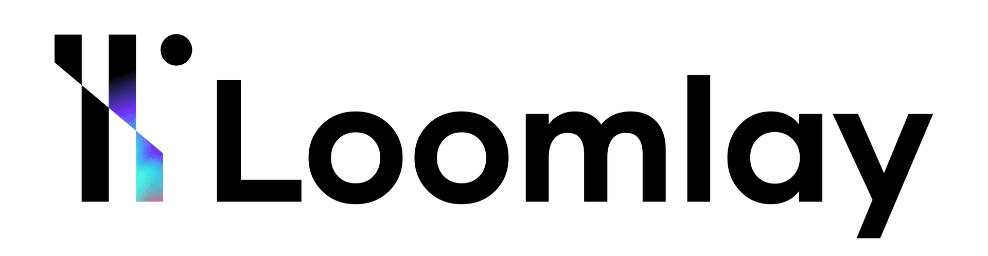
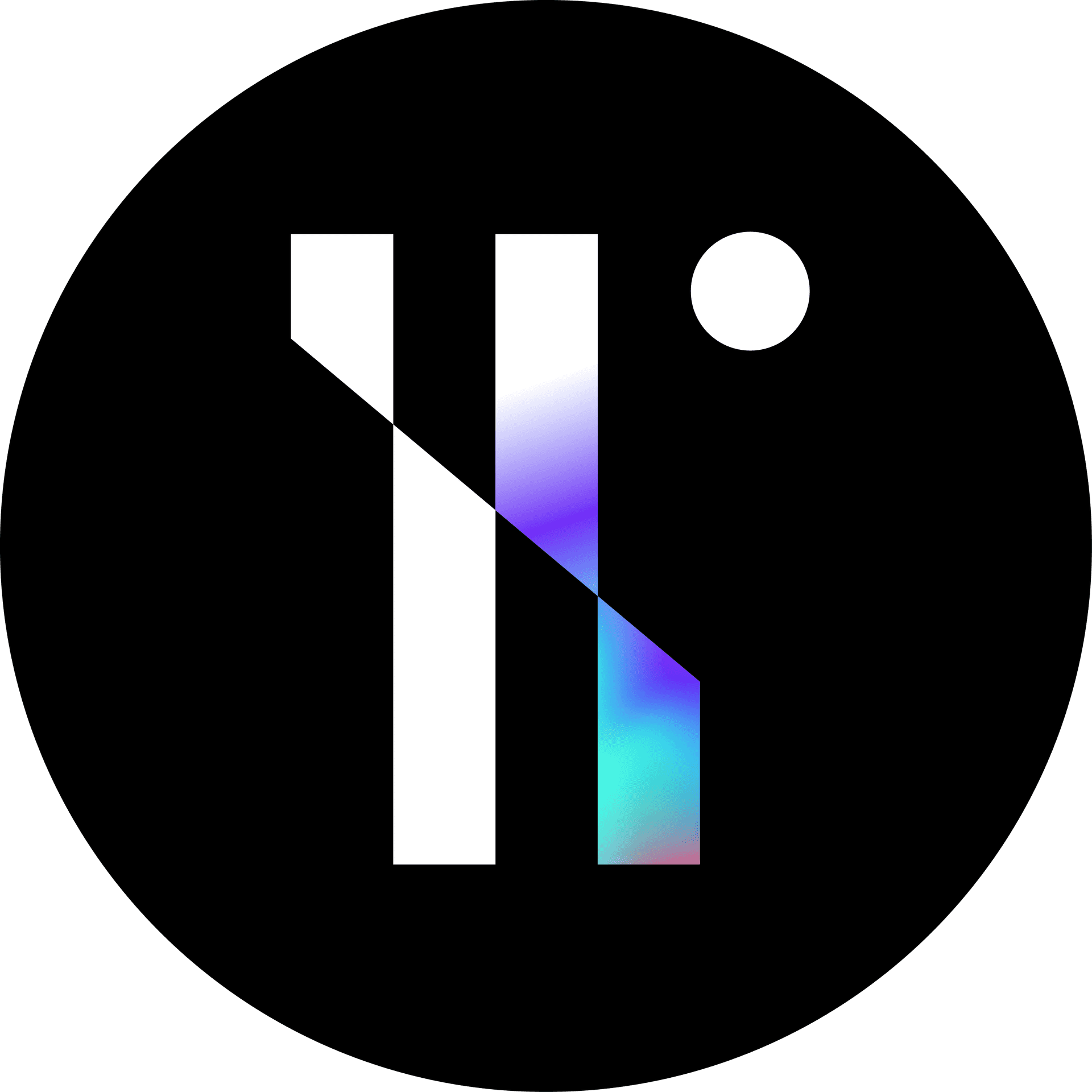
We built the mark from two parallel L forms, connected by a diagonal cut and offset with a single circular point. Black and white carry most of the system; cyan, violet and pink enter only where the forms cross.
Gilmer gives the type system the same balance: geometric enough to belong with the monogram, but open and readable across the wordmark, campaign headlines and explanatory copy.
Structure carries the identity. Gradient carries the signal.
The LL construction remains legible in one color. The iridescent spectrum is a controlled layer inside the crossing form, not a background effect applied everywhere.
Gilmer
Regular for explanatory copy. Bold for the wordmark, headings and concise campaign statements.
Intelligence, made legible.
RegularABCDEFGHIJKLMNOPQRSTUVWXYZ
abcdefghijklmnopqrstuvwxyz 0123456789
BoldABCDEFGHIJKLMNOPQRSTUVWXYZ
abcdefghijklmnopqrstuvwxyz 0123456789
The core cyan–violet–pink transition used inside the monogram.
A softer field for large identity applications and close crops.
A horizontal reading of the same spectrum for dividers and transitions.
Structure first. Spectrum second.
The geometry identifies Loomlay before the gradient arrives; color adds energy without carrying the whole brand by itself.
The identity now meets a working product
Loomlay has continued to evolve beyond the earlier identity work documented here. These current public screens show the product in use as context; they are not presented as part of the 2024 identity delivery.
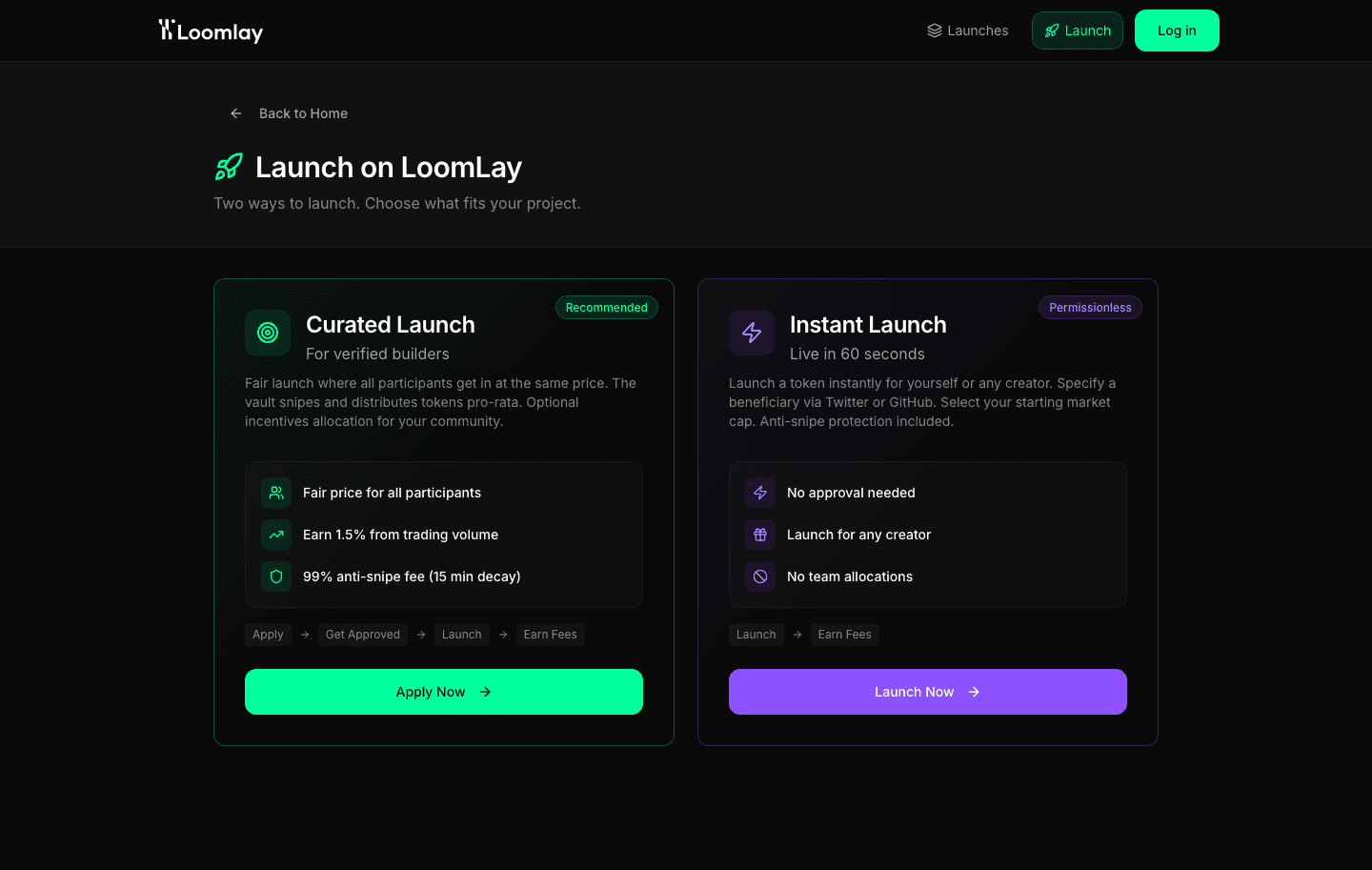
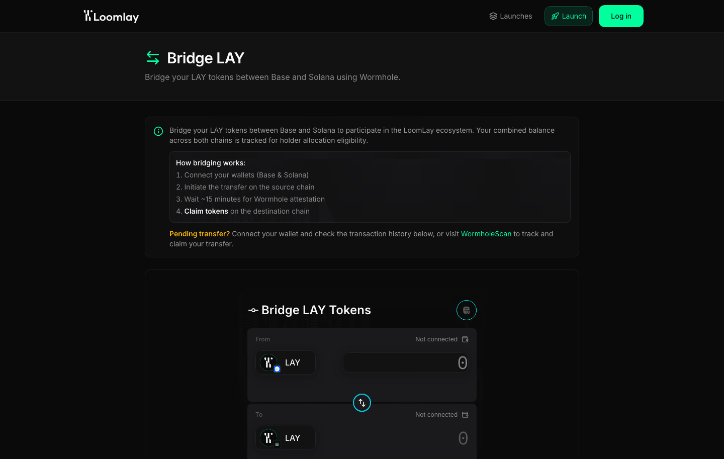
Two routes to launch · current product
The mark can hold or recede
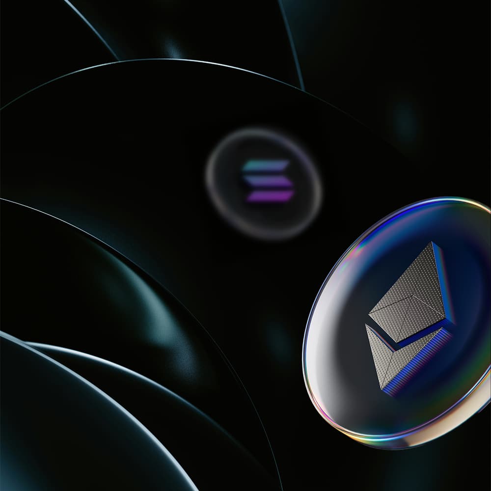
At close range, the diagonal crossing and gradient transition become the subject. In campaign imagery, the same spectrum is reduced to reflected light and controlled color at the edge of a dark surface.
The Wander Agency’s Web3 branding work for Loomlay centres on a reusable identity system: a logo that works in one colour, typography for technical explanations and art direction for campaign imagery. It addresses the need to introduce a complex product clearly while giving it a distinct visual character.
A small kit with a clear hierarchy
The identity is deliberately compact: geometry establishes recognition, typography carries information and the gradient marks moments of emphasis.
- 01
LL monogram
Two parallel forms joined by one diagonal crossing and a circular point.
- 02
Gilmer typography
Regular and Bold weights keep the wordmark, headings and explanatory copy in one family.
- 03
Iridescent spectrum
Cyan, violet and pink are constrained to transitions, highlights and selected image surfaces.
- 04
Campaign framework
A modular grid gives technical proposition copy an explicit reading order.

MintMine
Brand identity · Making the complex legible · 2021