People-first operator · Rebrand
Holiday Tours
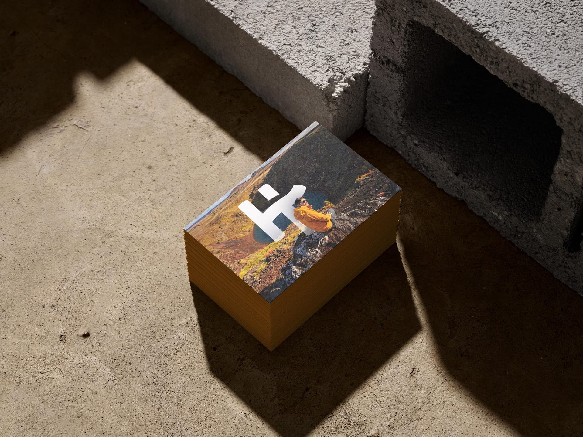
A lively identity for an Icelandic operator that puts people inside the picture.
- Services
- RebrandingLogo DesignBrand GuidelinesPrint DesignSocial Media
- Industry
- Iceland tours
- Year
- 2024
Challenge
Holiday Tours is an Icelandic tour operator offering day excursions, private tours, custom itineraries and activities. Its rebrand needed enough warmth for a people-led experience and enough order to handle a broad offer across print, social and web.
The expressive logo and color could not become a free-for-all once different formats and teams began using them.
Approach
The Wander Agency developed the tour operator’s rebrand across logo design, visual identity, brand guidelines, print and social media, with a supporting website concept. An exuberant hand-drawn mark, direct type, saturated coral and human photography give the system its character.
A detailed brandbook governs the energy while the digital direction keeps the offer practical: travelers can browse regular tours or move into a more personal custom enquiry route.
Playful by design. Governed in use.
The looseness lives in the mark and the voice; a firm set of rules keeps that personality intact from a small card to a street poster.
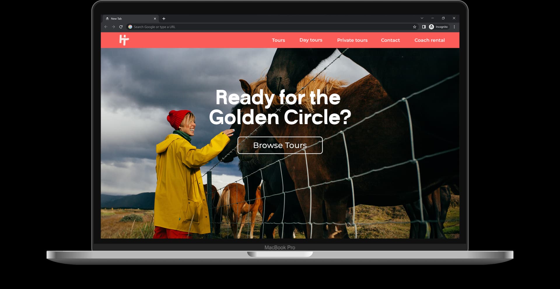
Tour operator web design with the same character
The desktop concept brings the coral navigation and bold type into a straightforward browse-and-book surface.
Human photography keeps the offer warm while clear tour labels do the practical work. The design explores a common tour operator website brief: make scheduled departures easy to browse while giving travellers with a custom trip in mind a clear enquiry route.
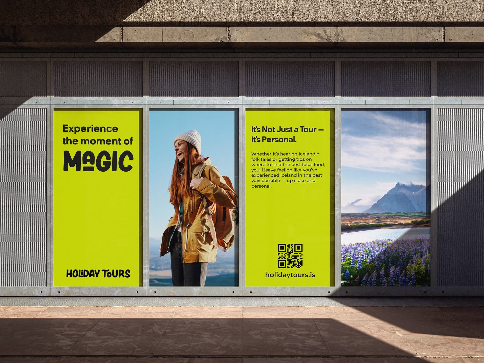
The promise moves into the city
A four-part wall installation alternates direct language, an expressive traveler and the Icelandic landscape. At architectural scale, the system remains energetic without becoming visually crowded.
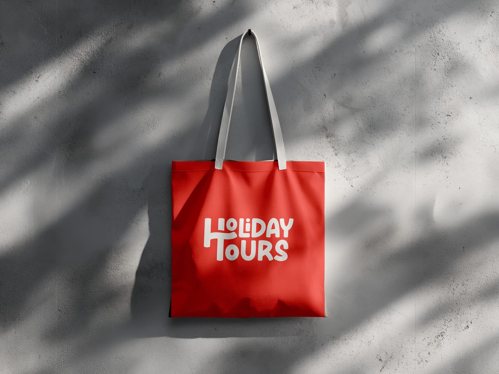
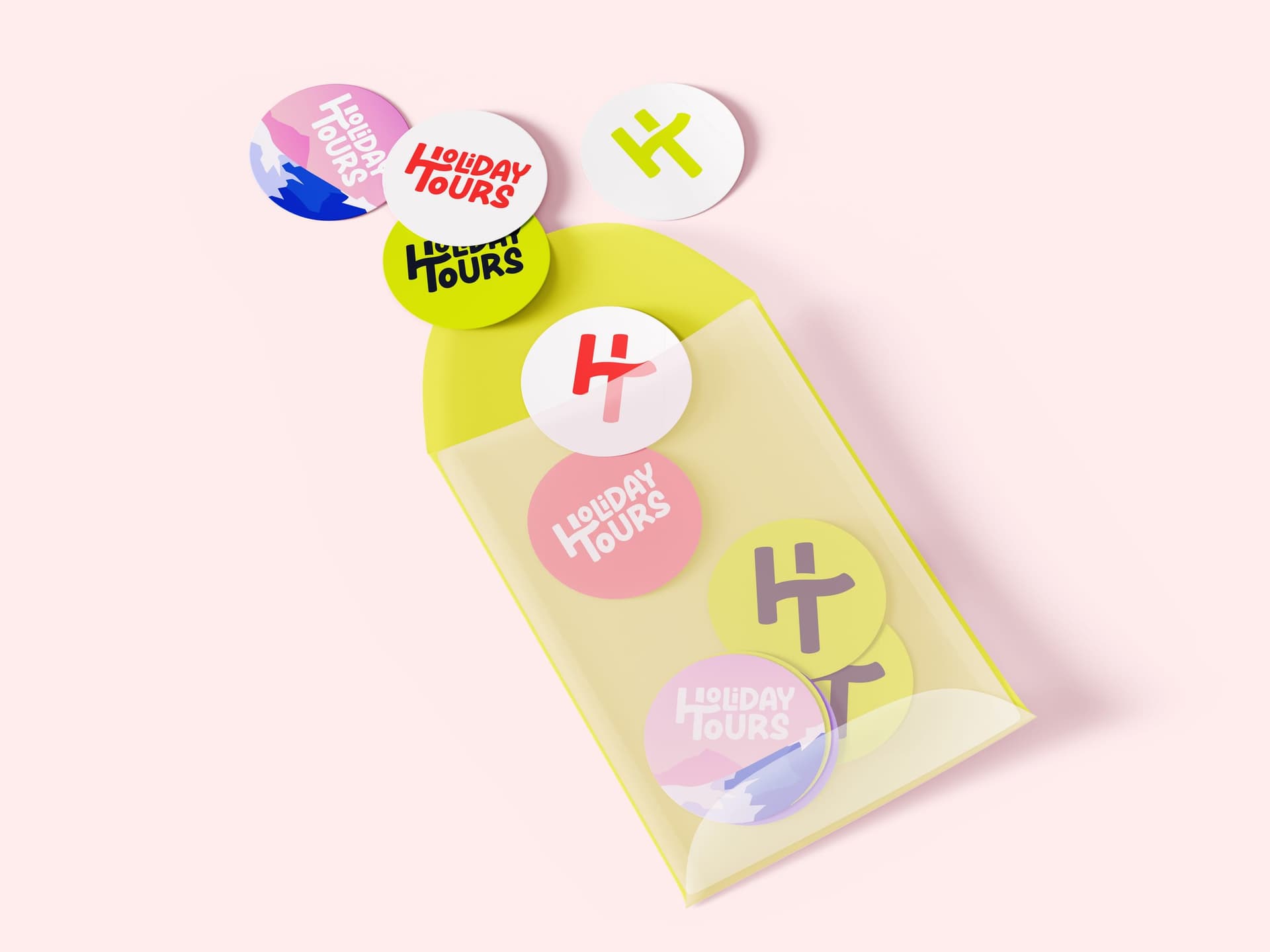
Useful objects, unmistakable character
The identity does not rely on one oversized logo. Color, material and the playful mark work together across objects people can carry, keep and share.
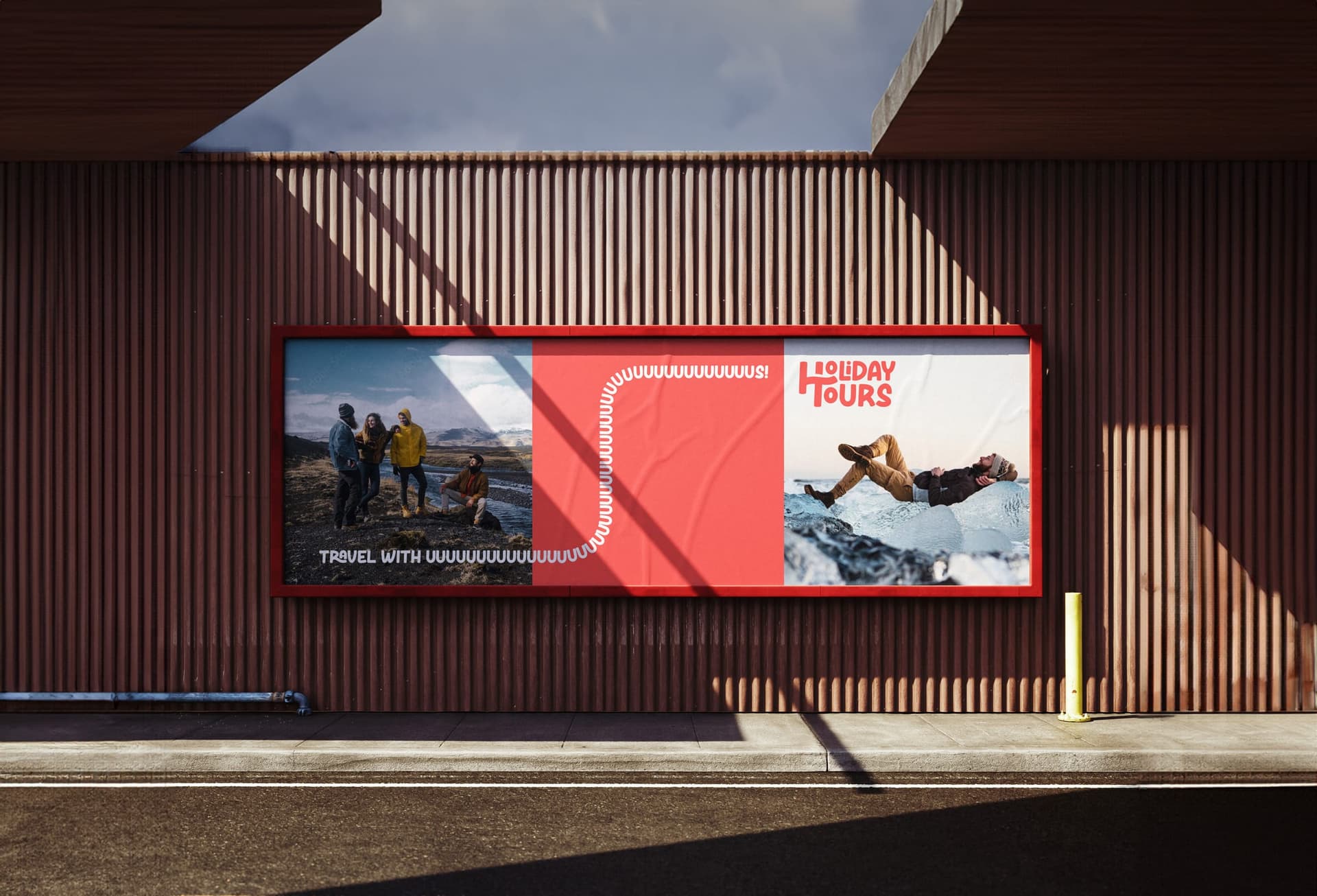
Big type, real people, one long hello
The poster family stretches the voice into the street: candid Iceland photography, a coral field and an intentionally overlong greeting that is hard to miss.
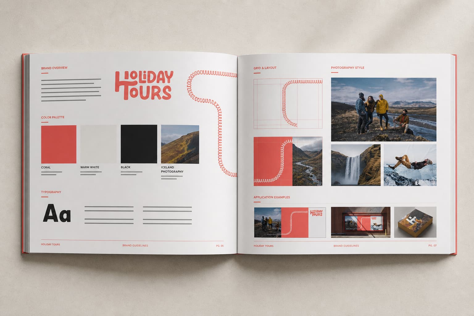
The rules behind the personality
This case-study reconstruction gathers the palette, typography, image direction and finished applications into one editorial view. It is shown as portfolio context, not as an original client document.
A character that holds together
The identity shifts tone and scale without losing the same recognizable hand.
- 01
Logo and color system
An expressive mark supported by a disciplined palette and spacing rules.
- 02
Brand guidelines
Practical governance for type, image, layout and everyday production.
- 03
Print and campaign
Business cards and posters that prove the system from pocket to street.
- 04
Responsive digital direction
A consistent route across desktop, mobile, social and custom-tour inquiries.
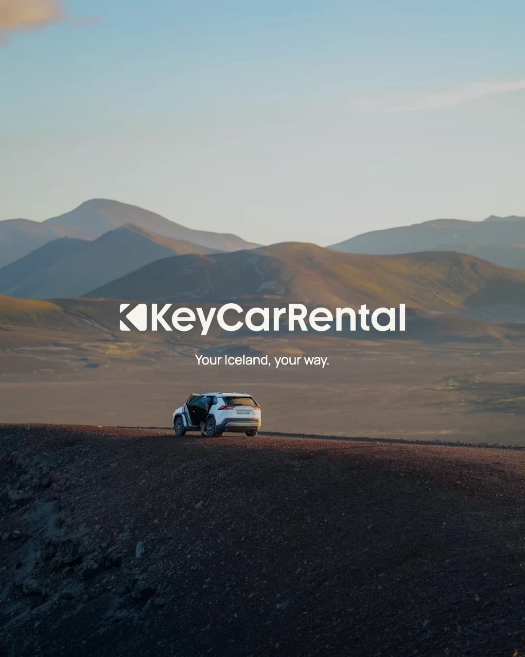
Key Car Rental
Icelandic road travel · Brand identity · 2026